Work
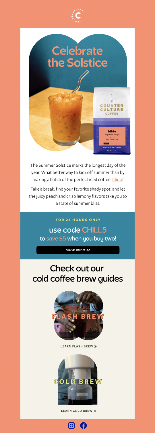
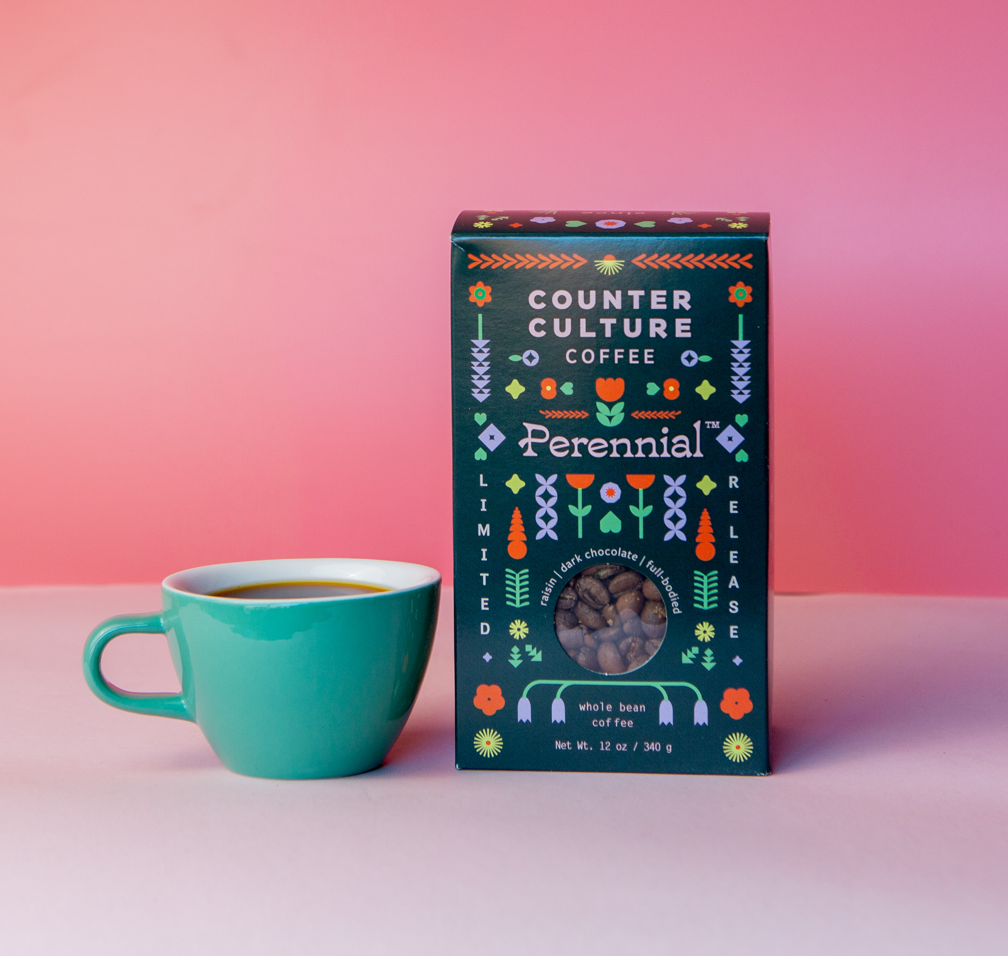
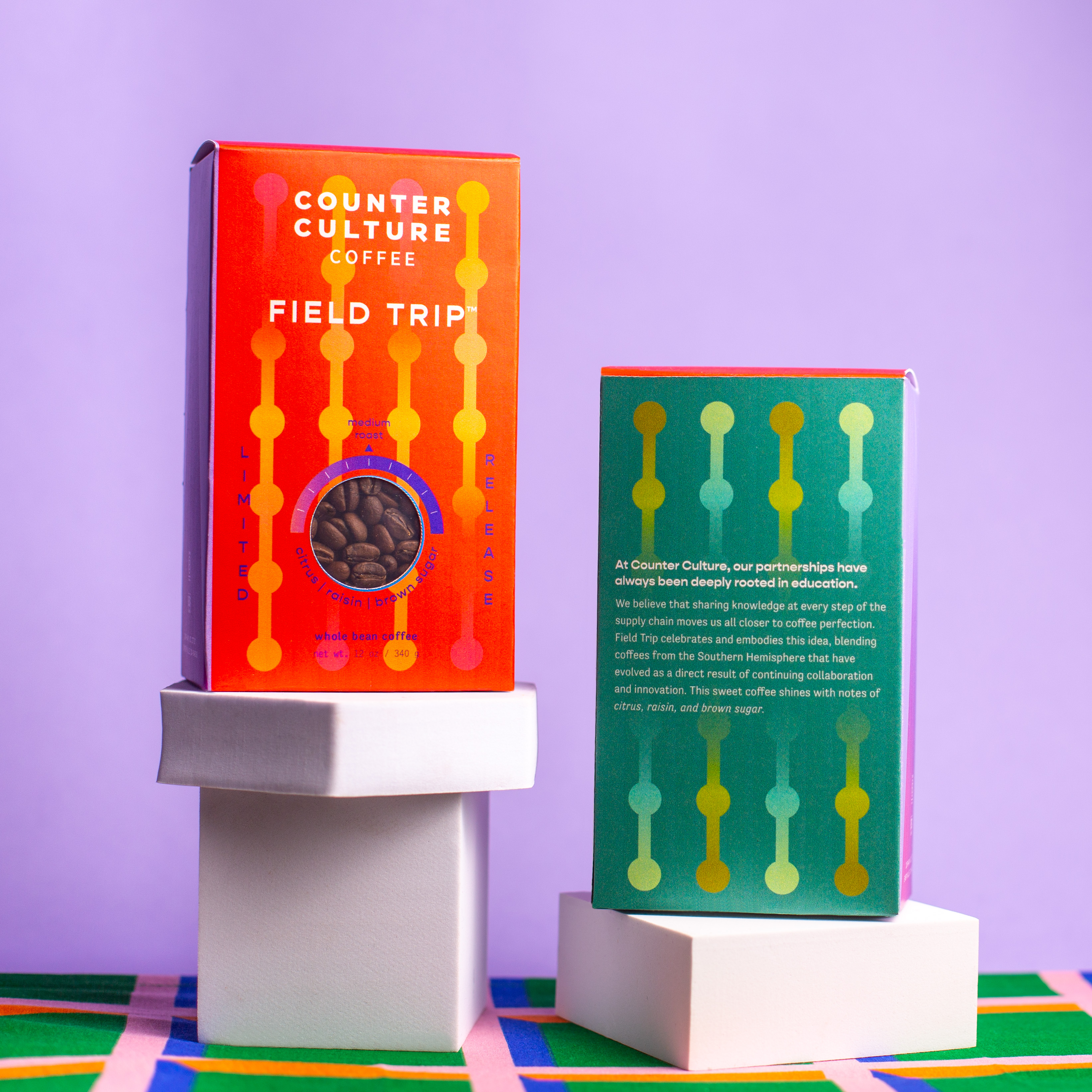
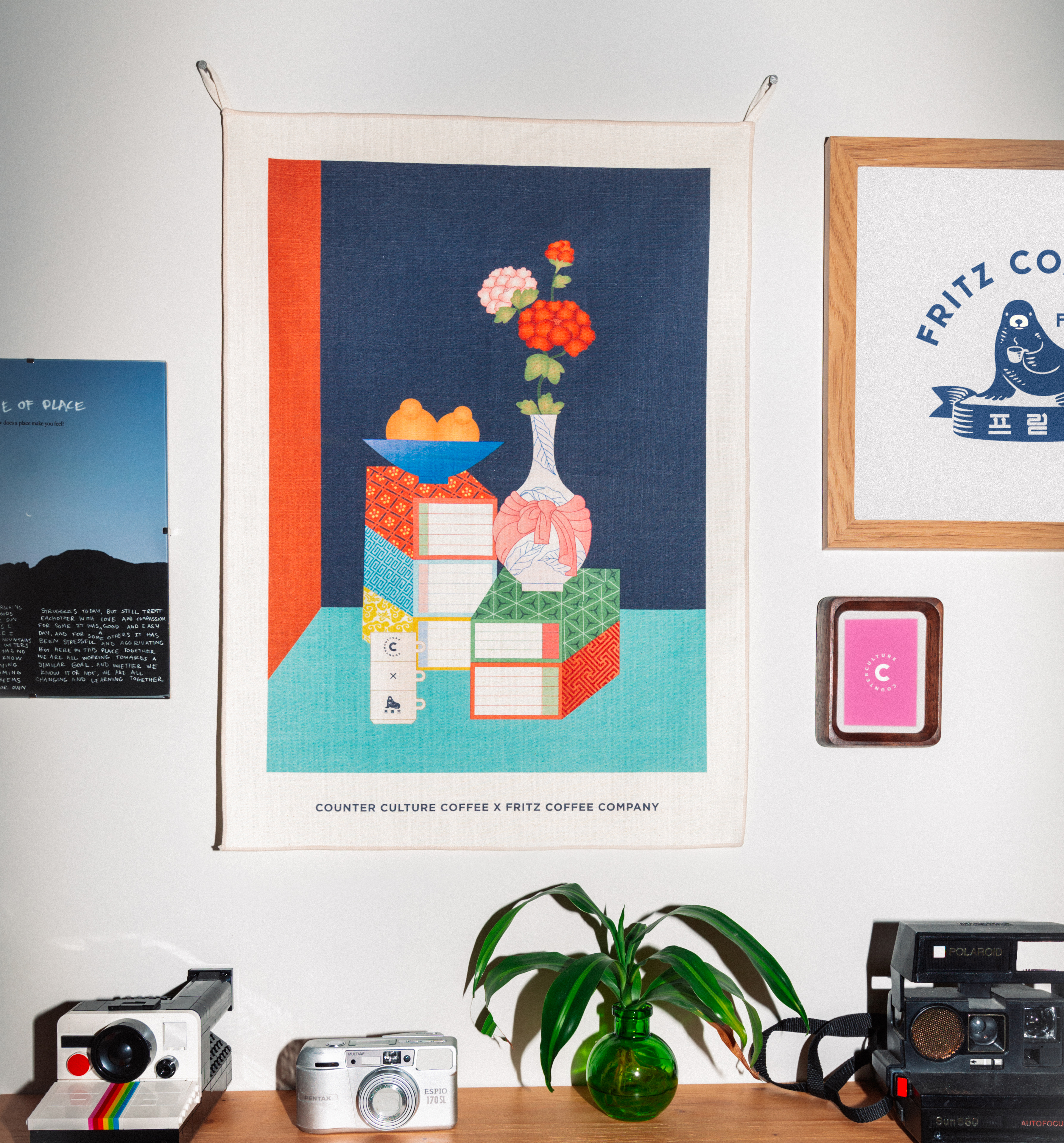
Limited Edition Series
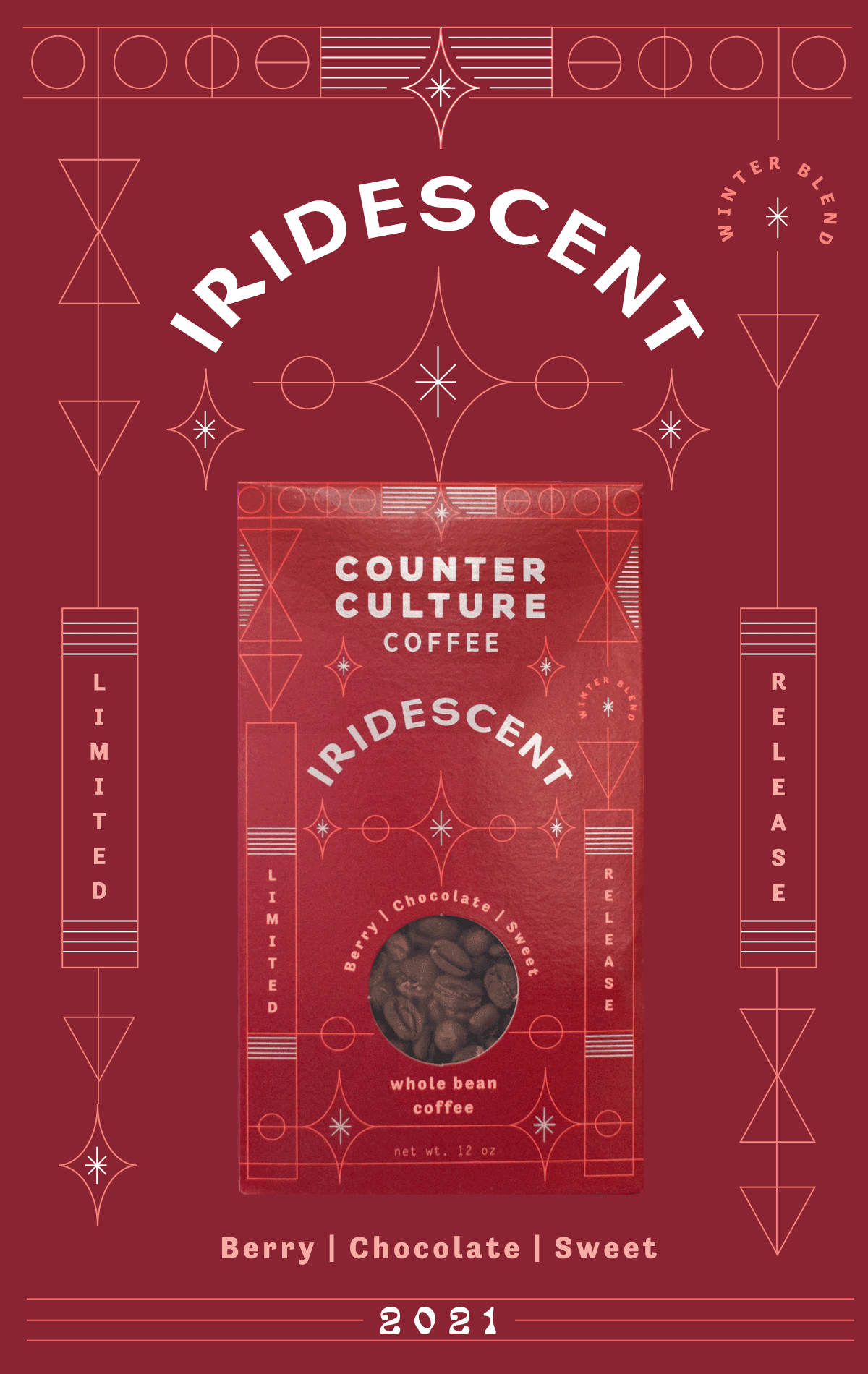
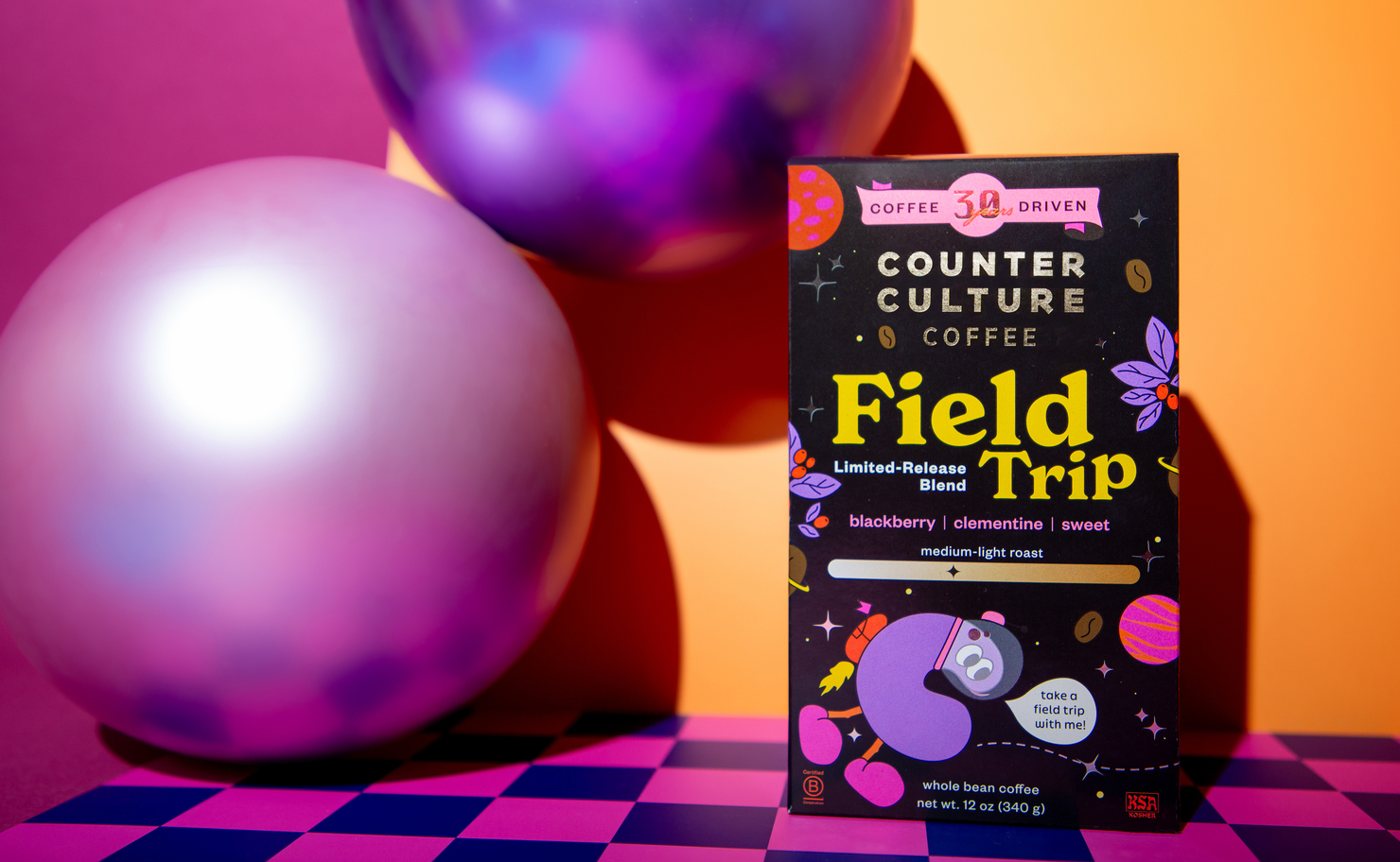
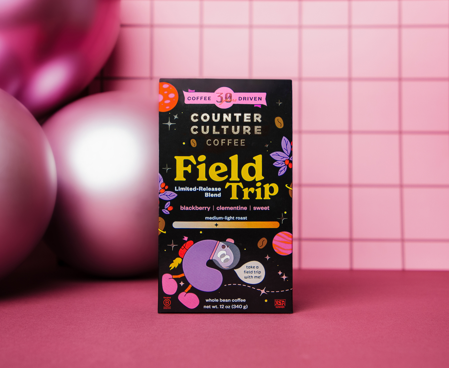
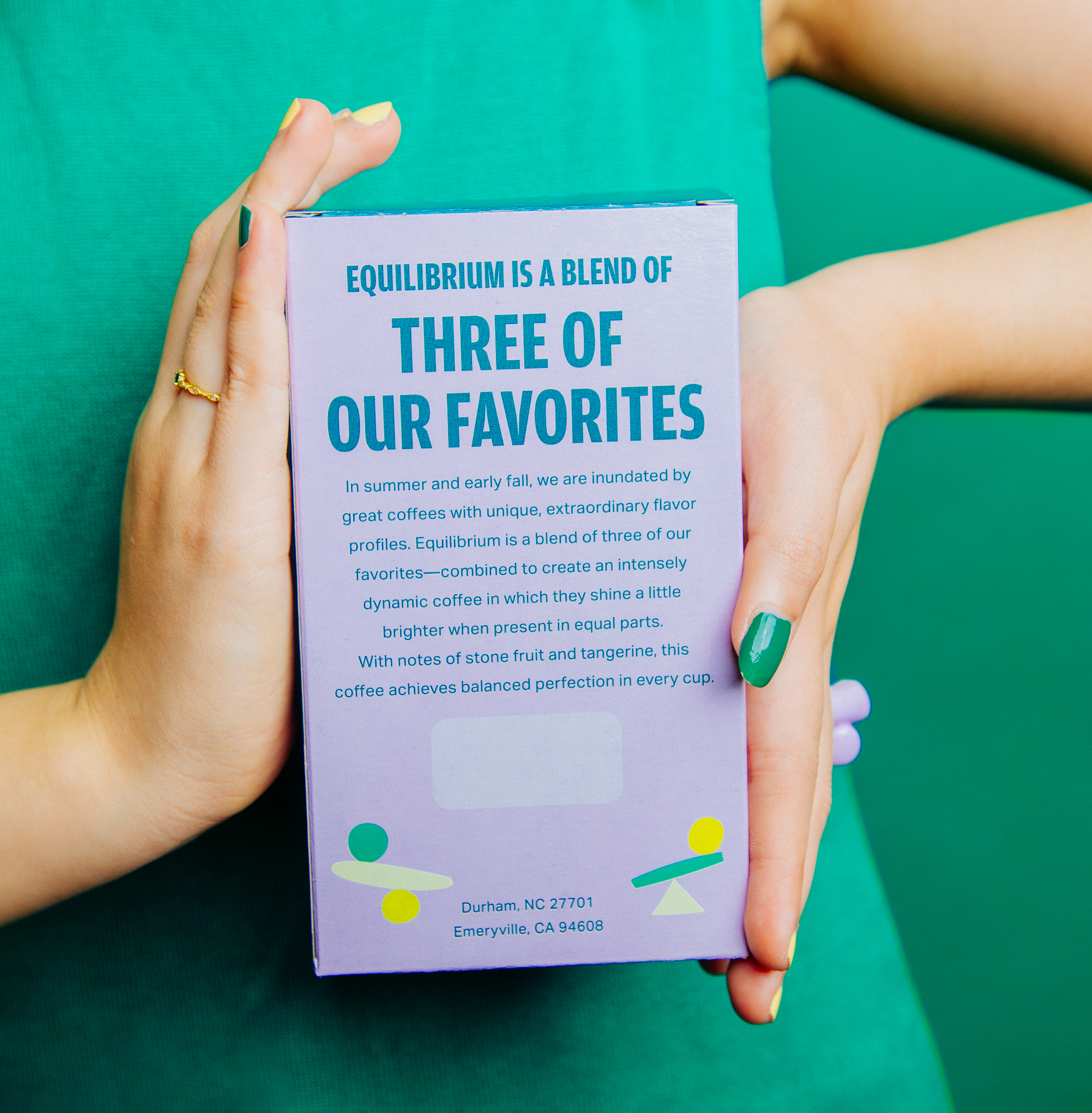
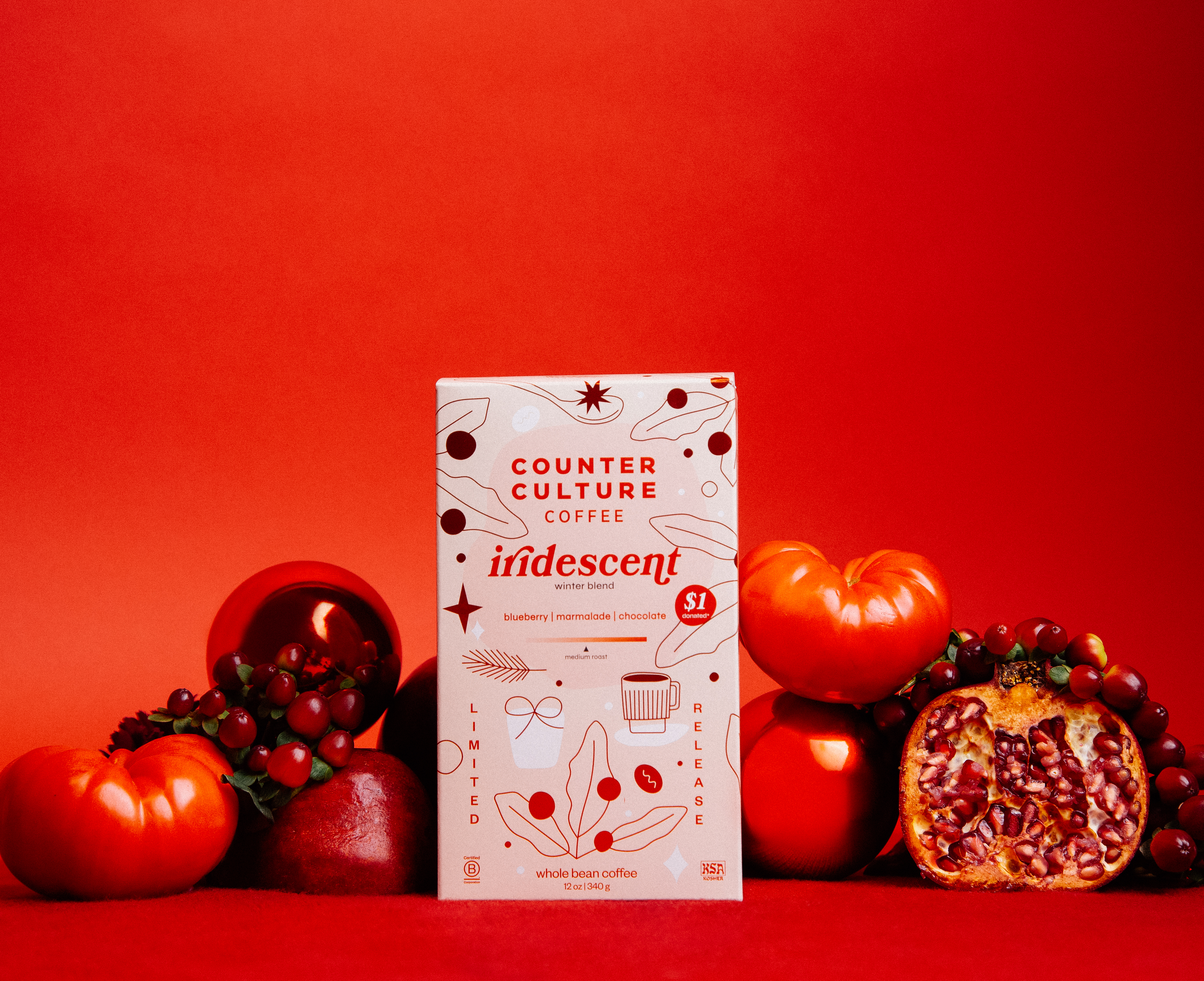
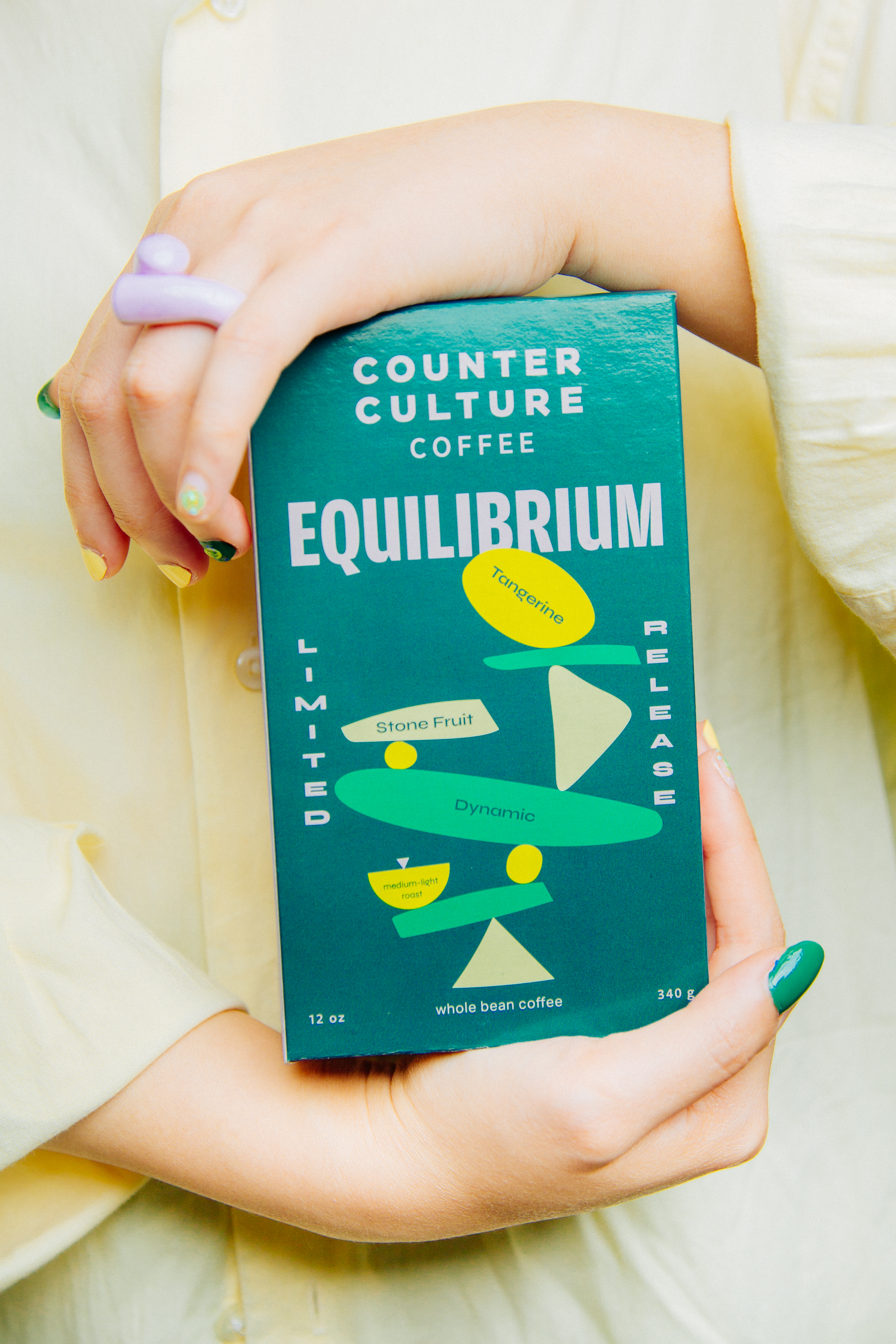
Perennial, Field Trip, Equilibrium, Iridescent — four seasonal coffees, four distinct visual worlds.
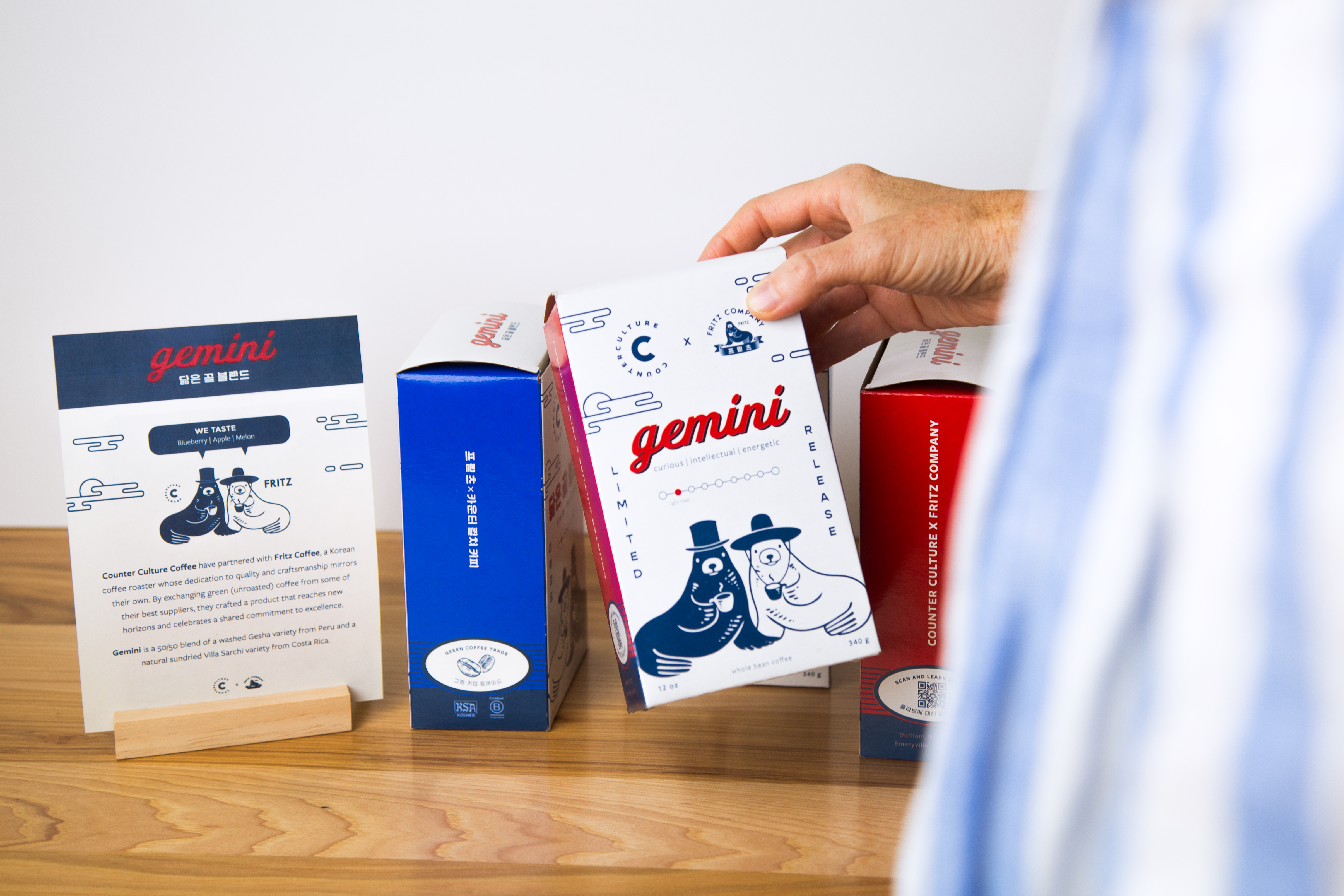
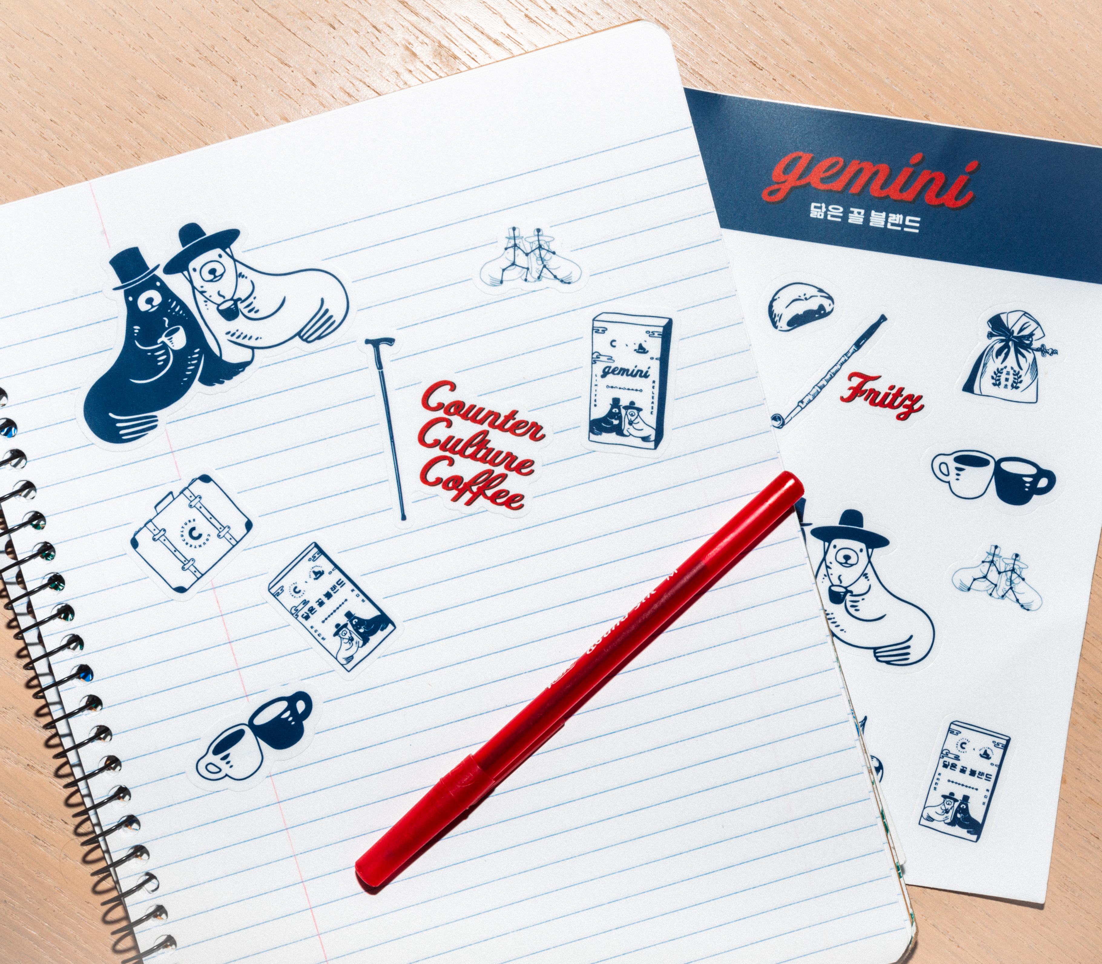
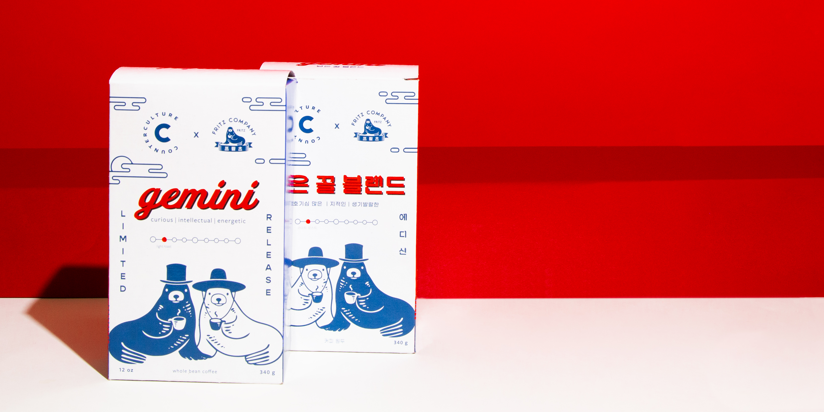
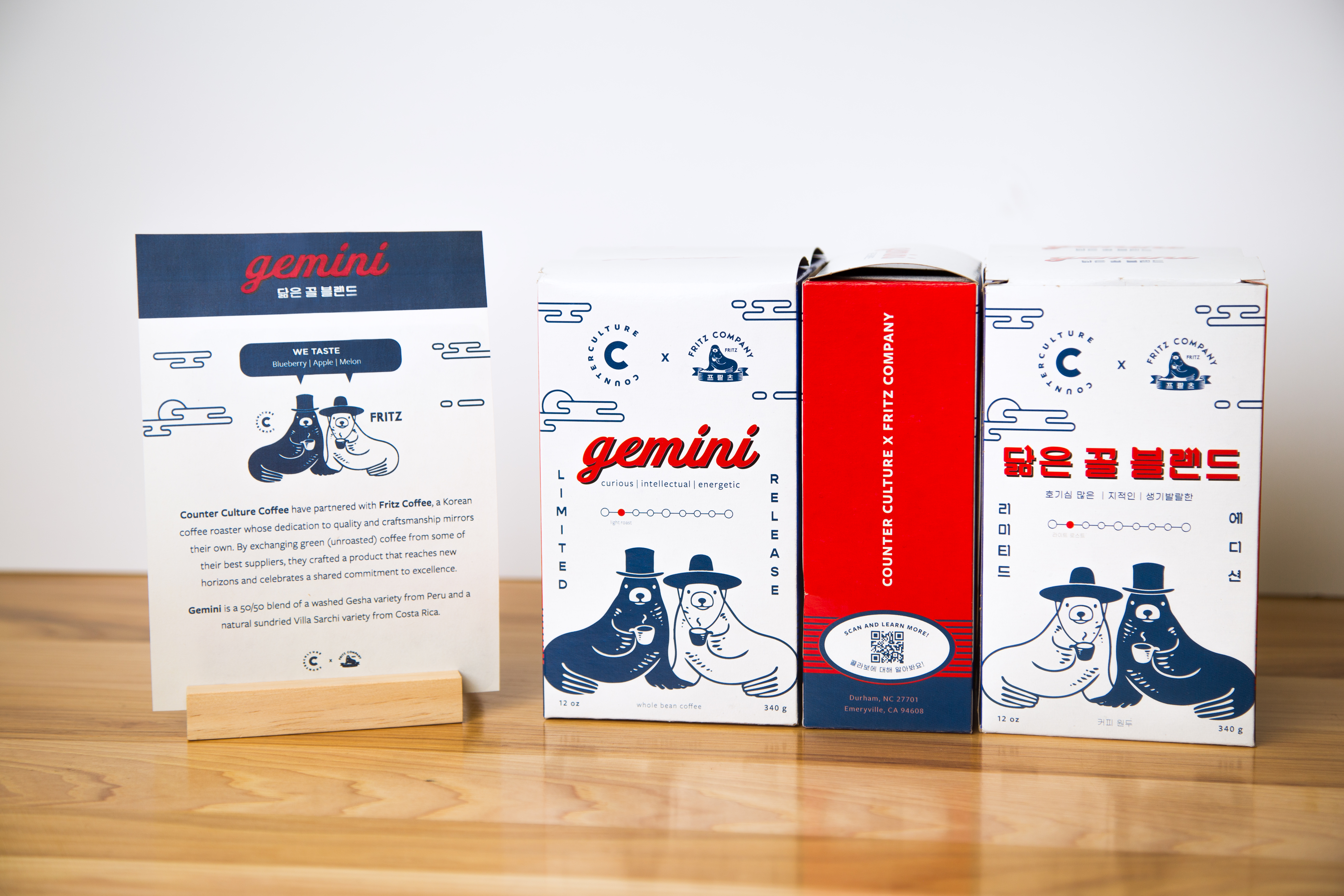
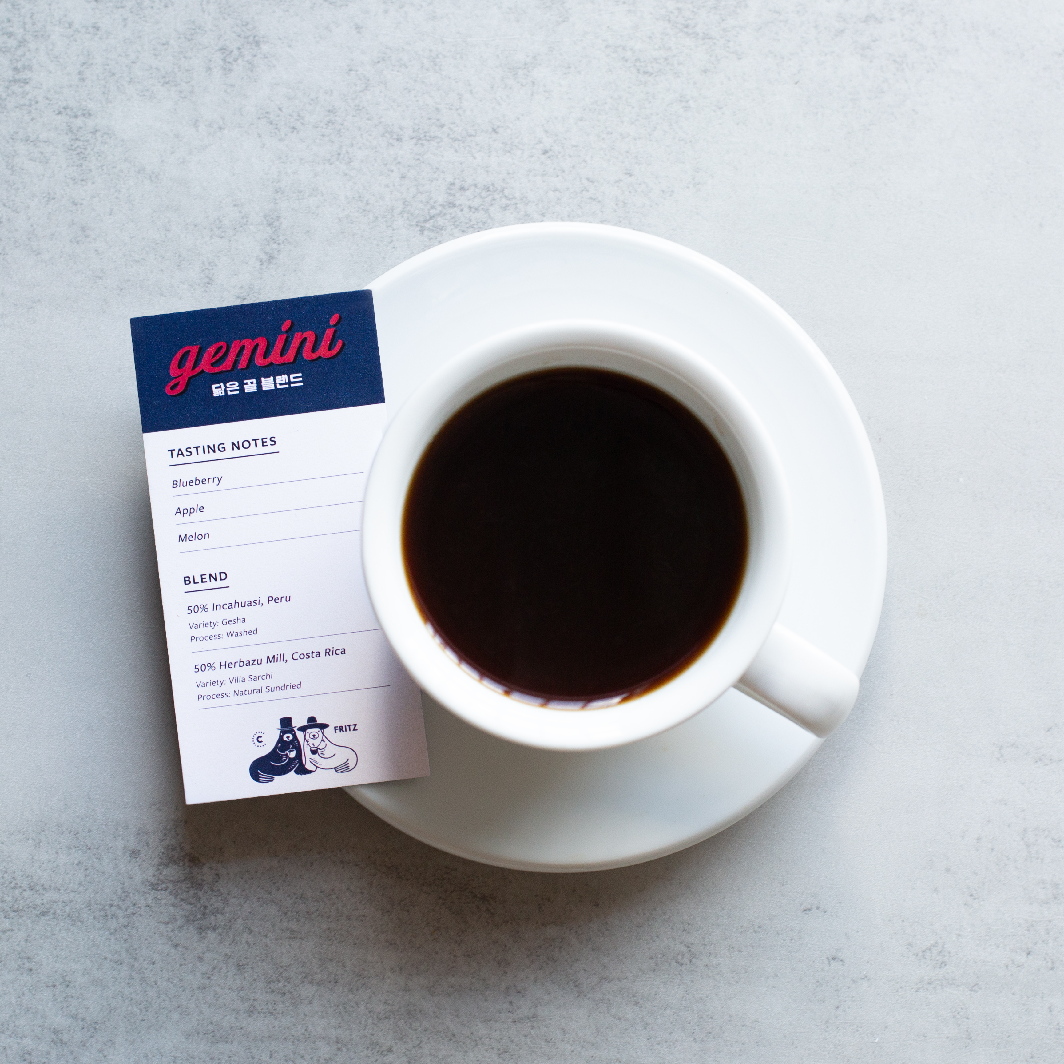
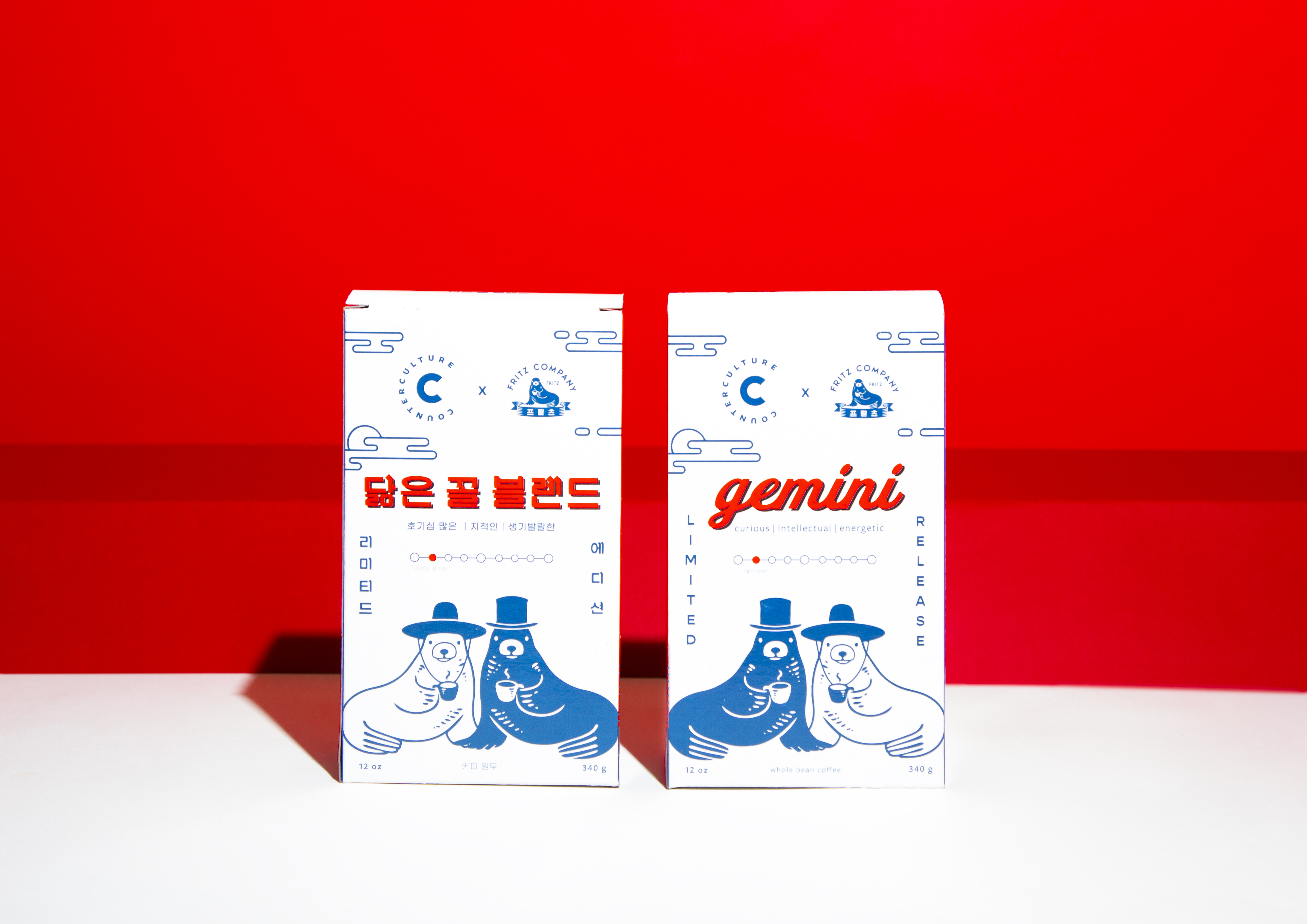
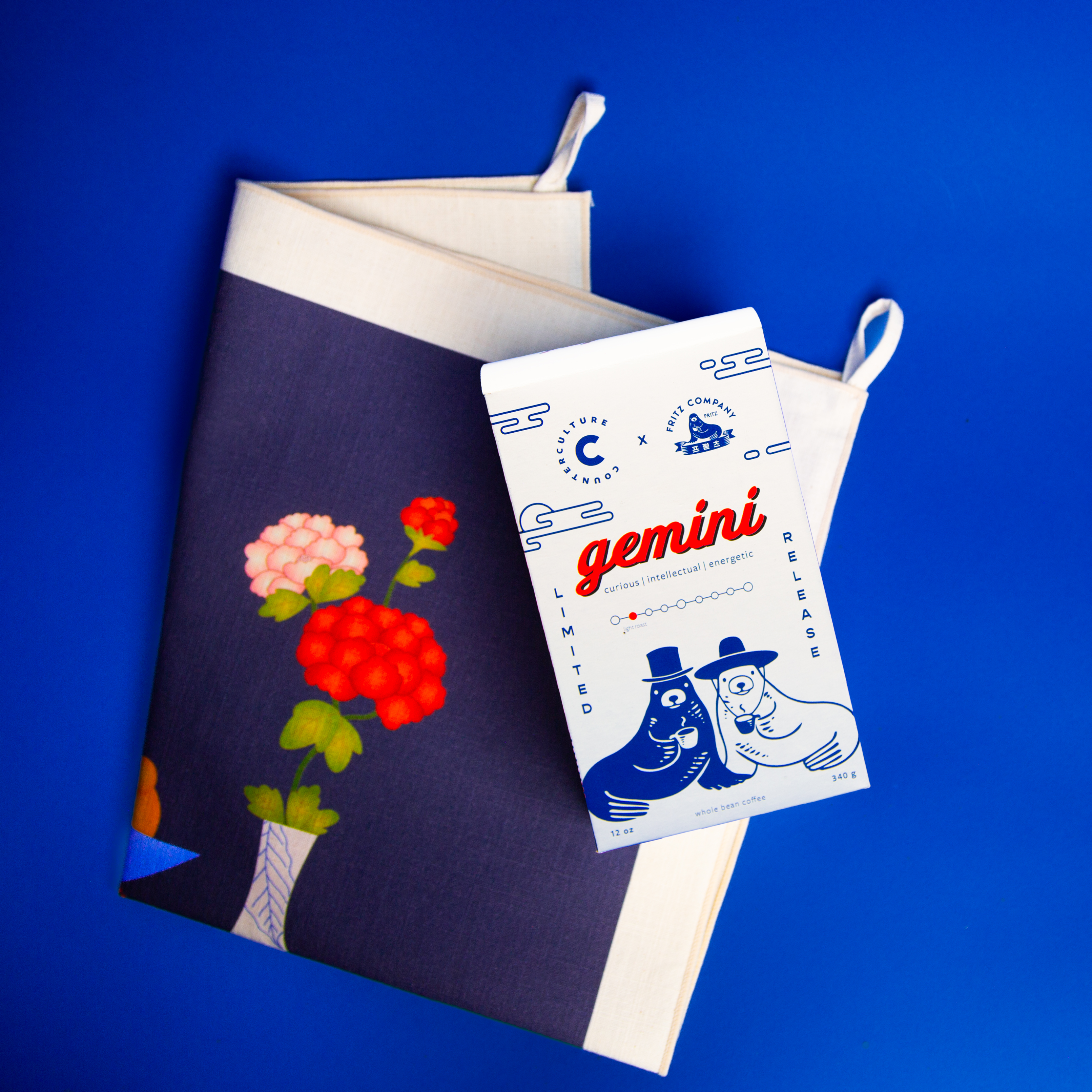
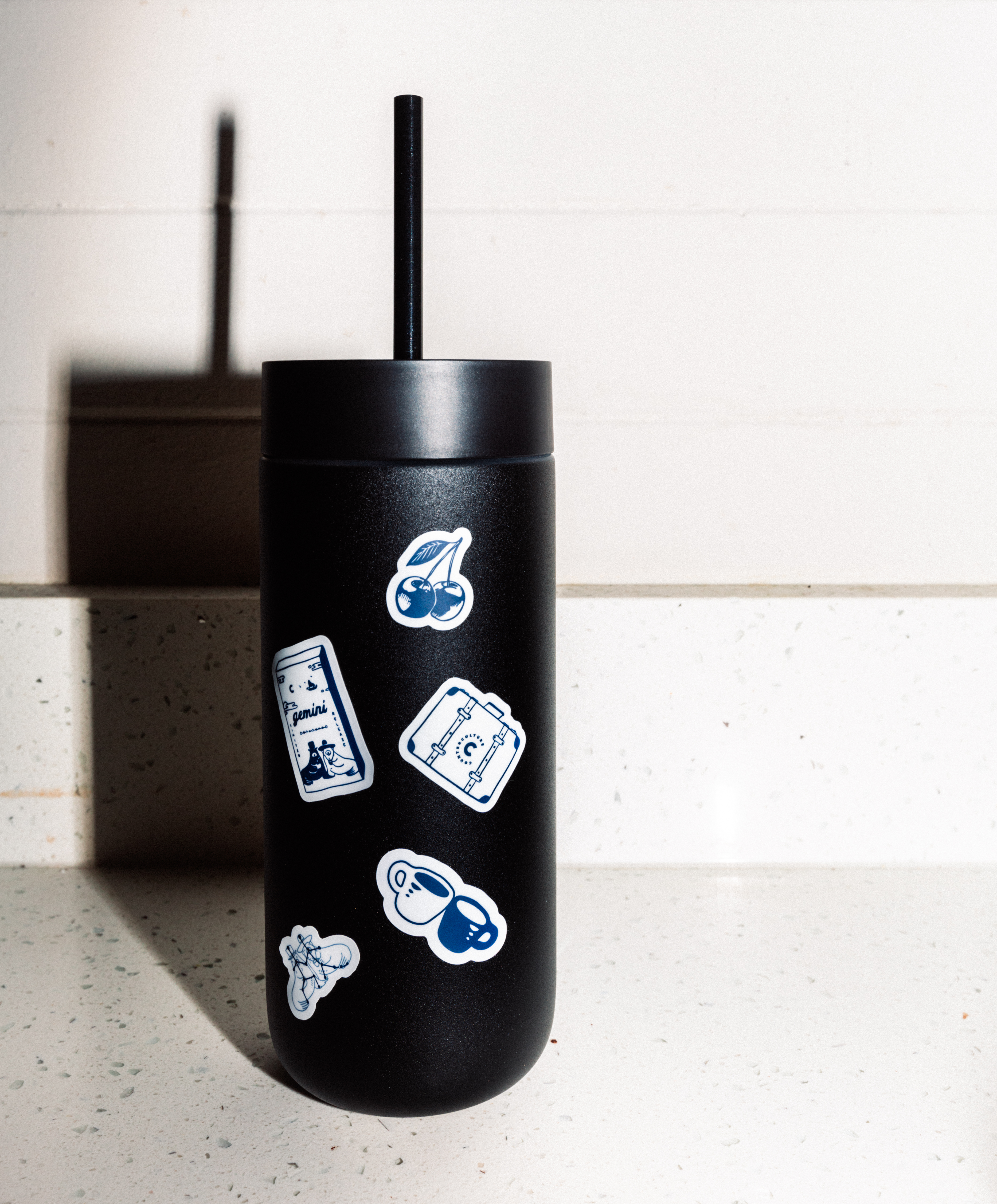
Gemini
A dual-origin blend identity exploring duality and balance through form and color.
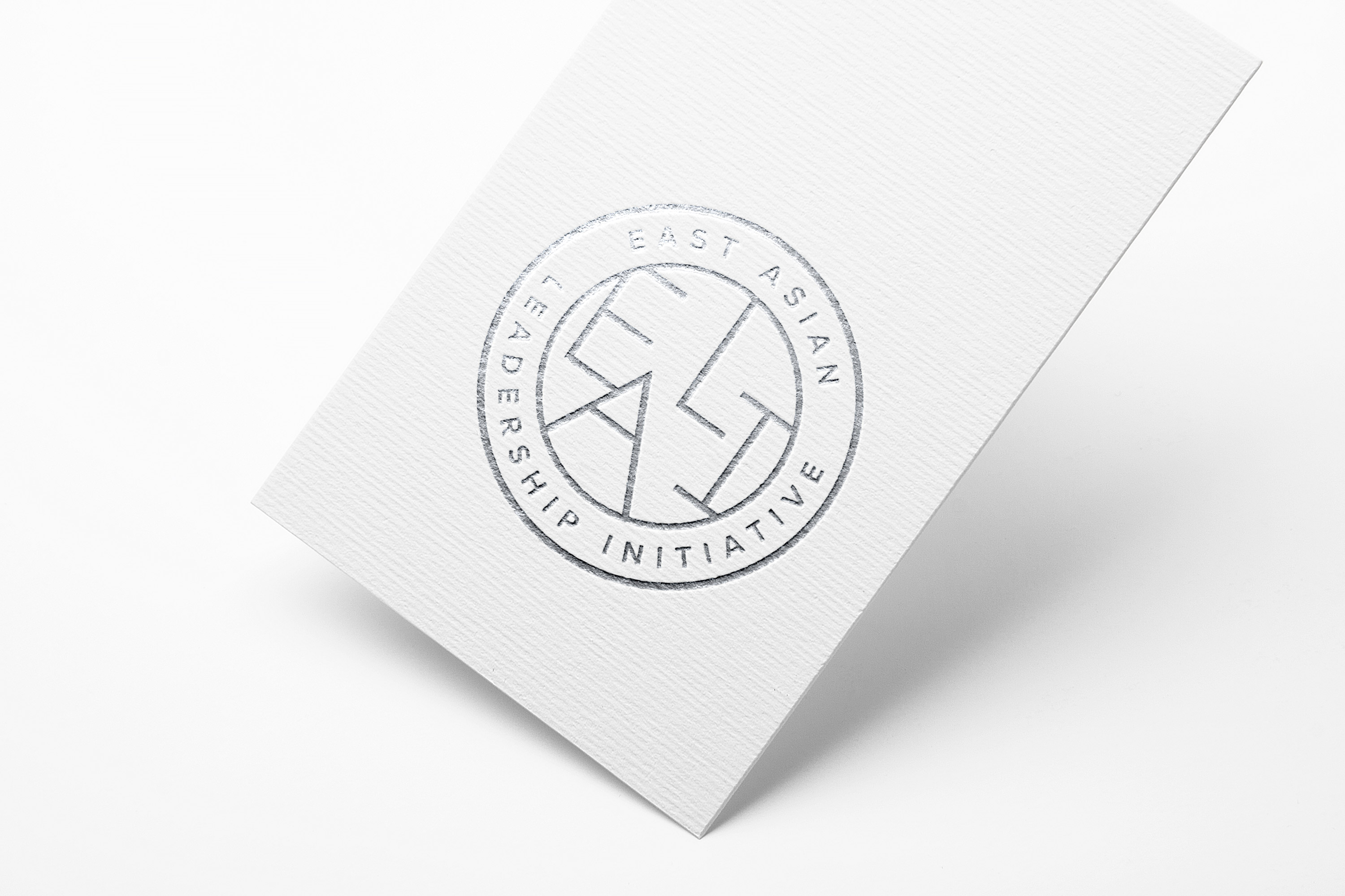
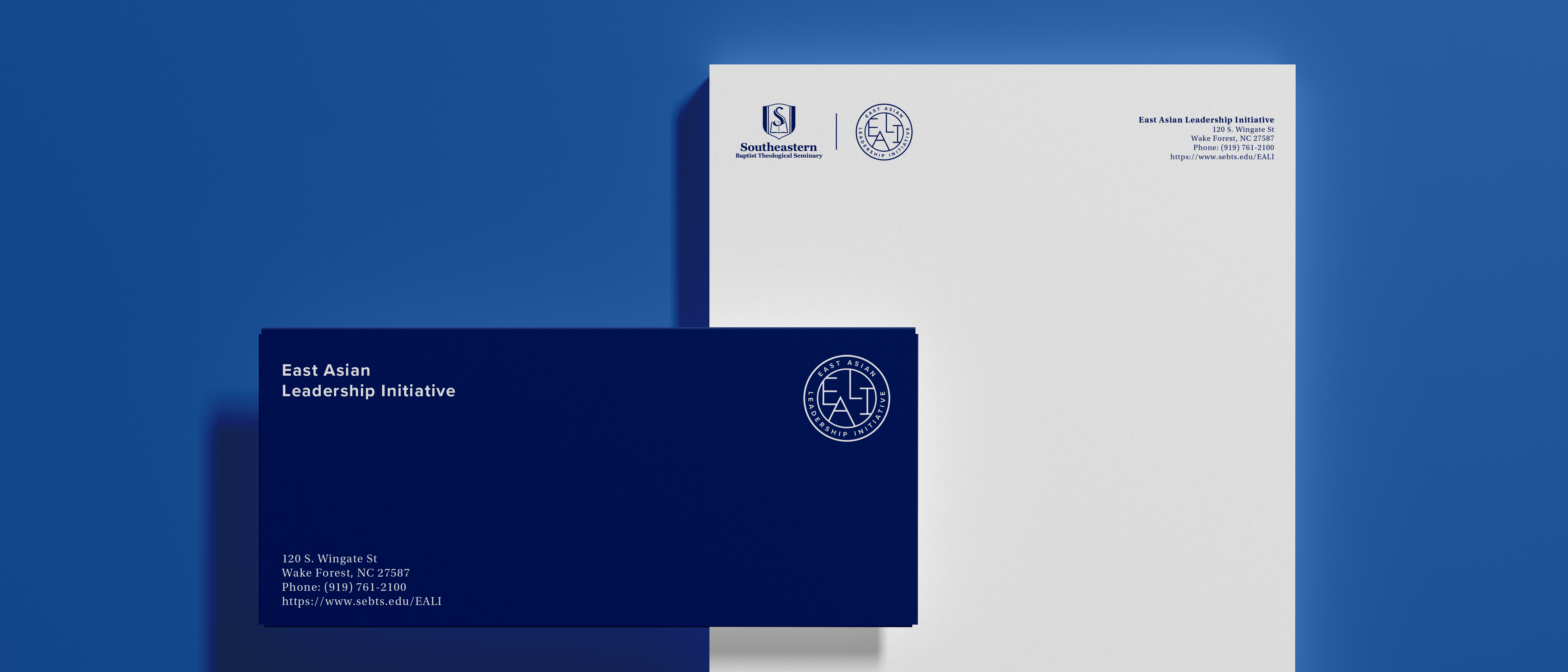
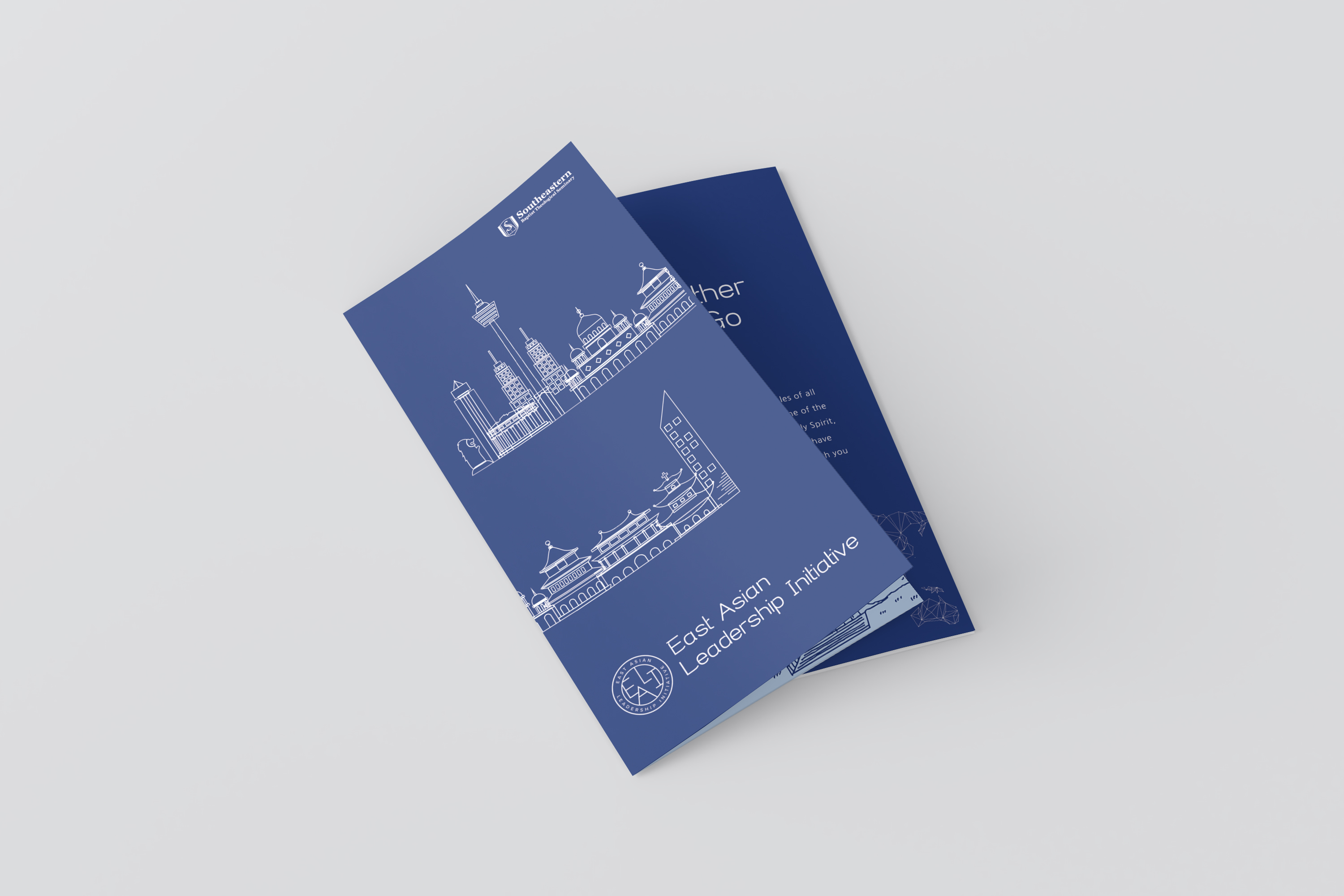
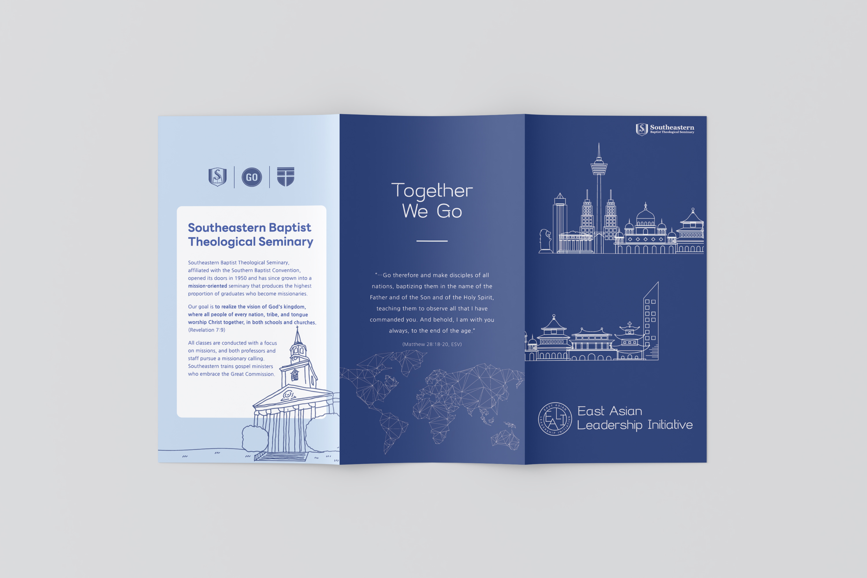
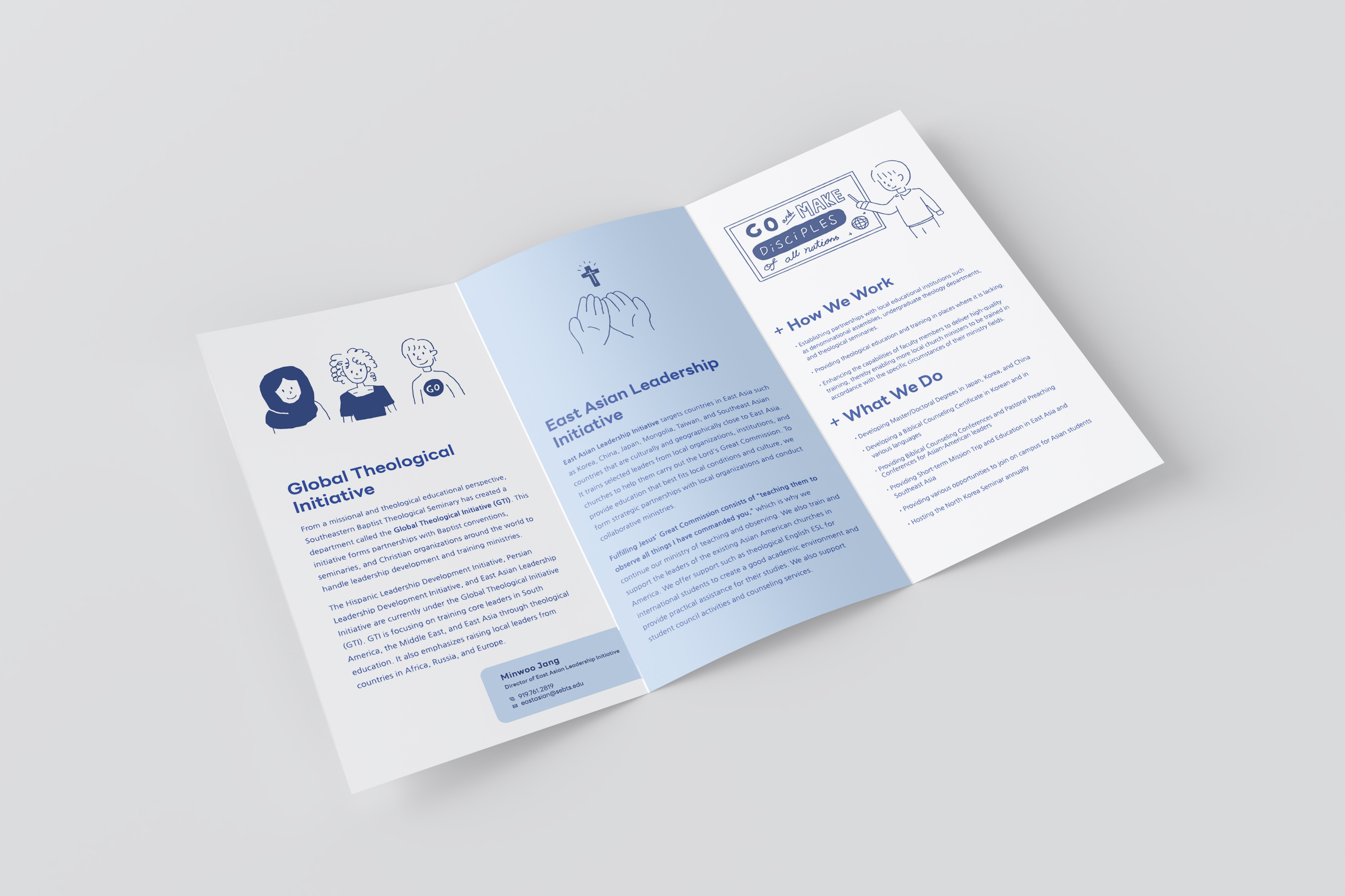
EALI Redesign
Refreshing the visual identity for the East Asian Leadership Initiative.
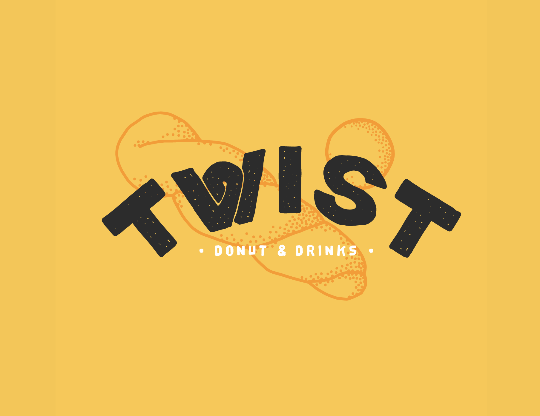
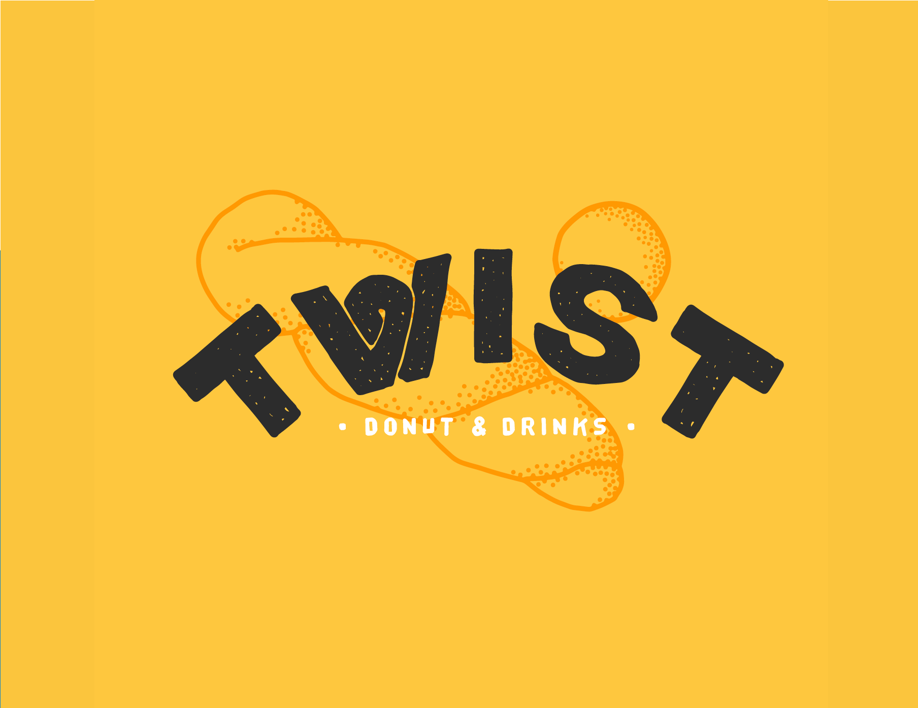
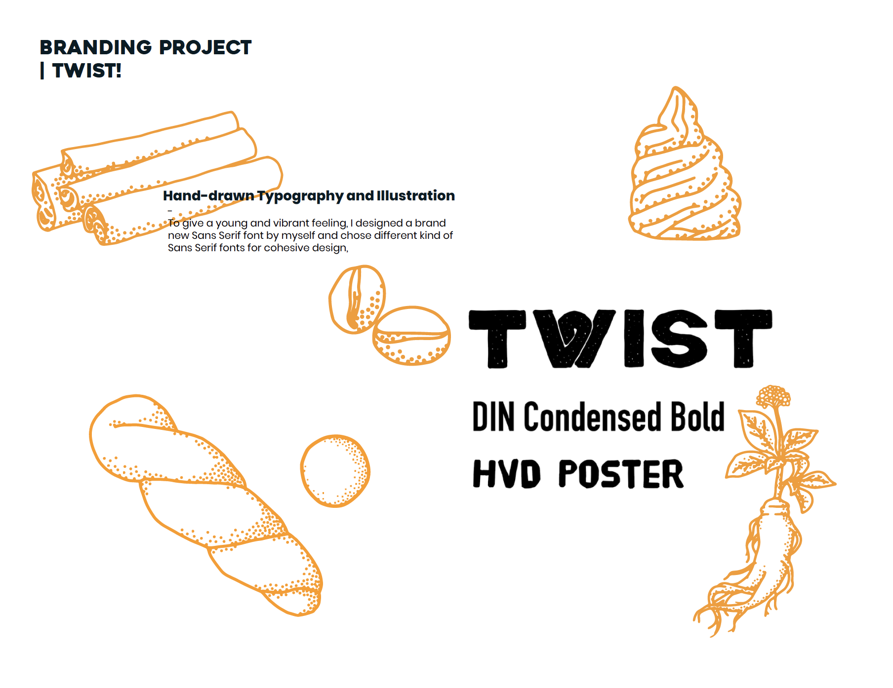
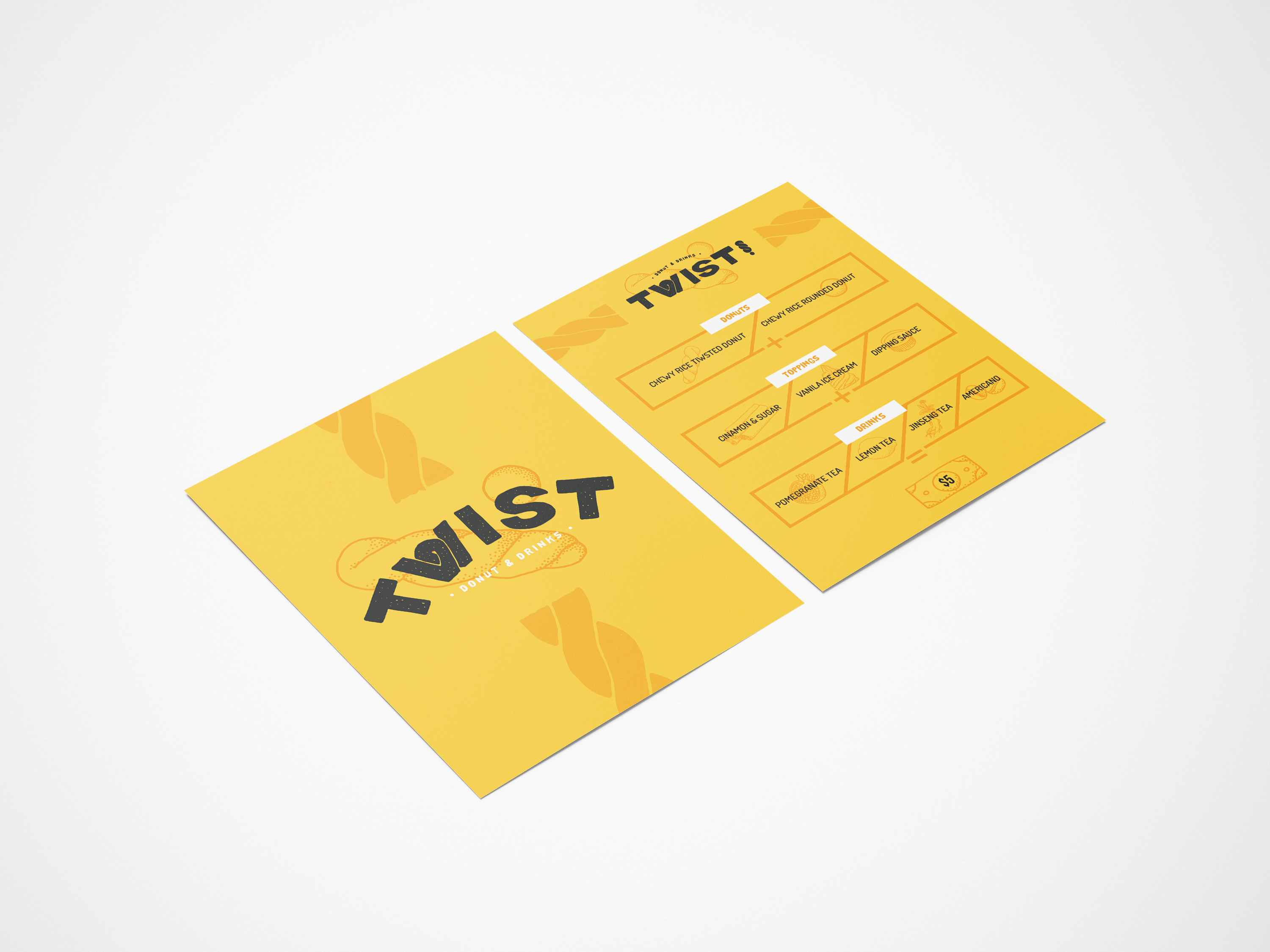
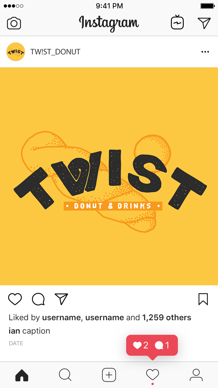
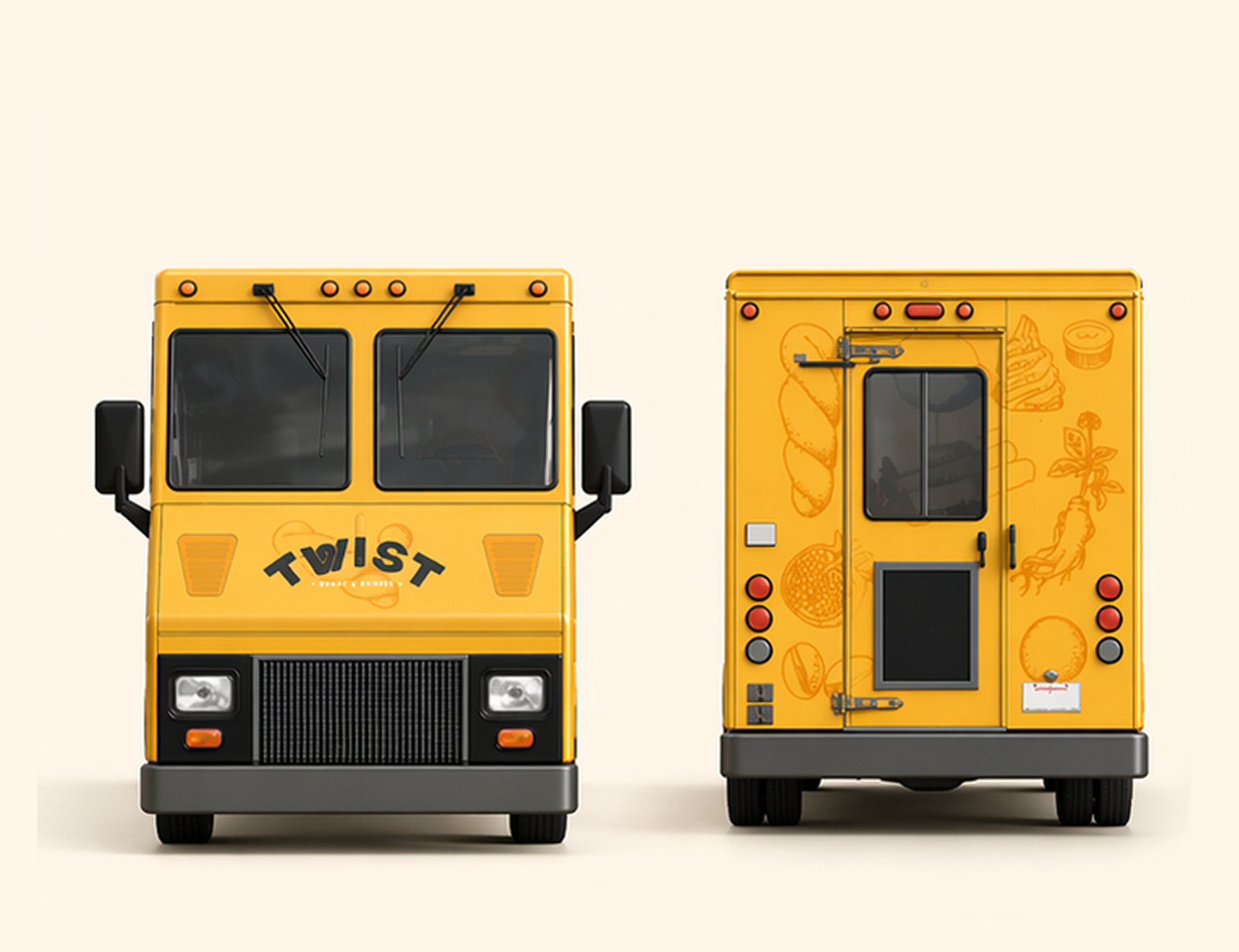
Tw!st
Full brand system for a bold, irreverent beverage concept with strong typographic character.
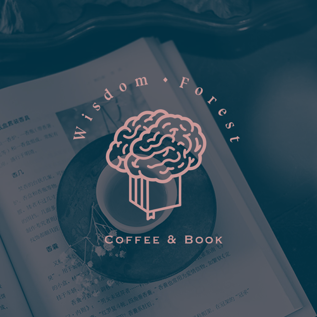
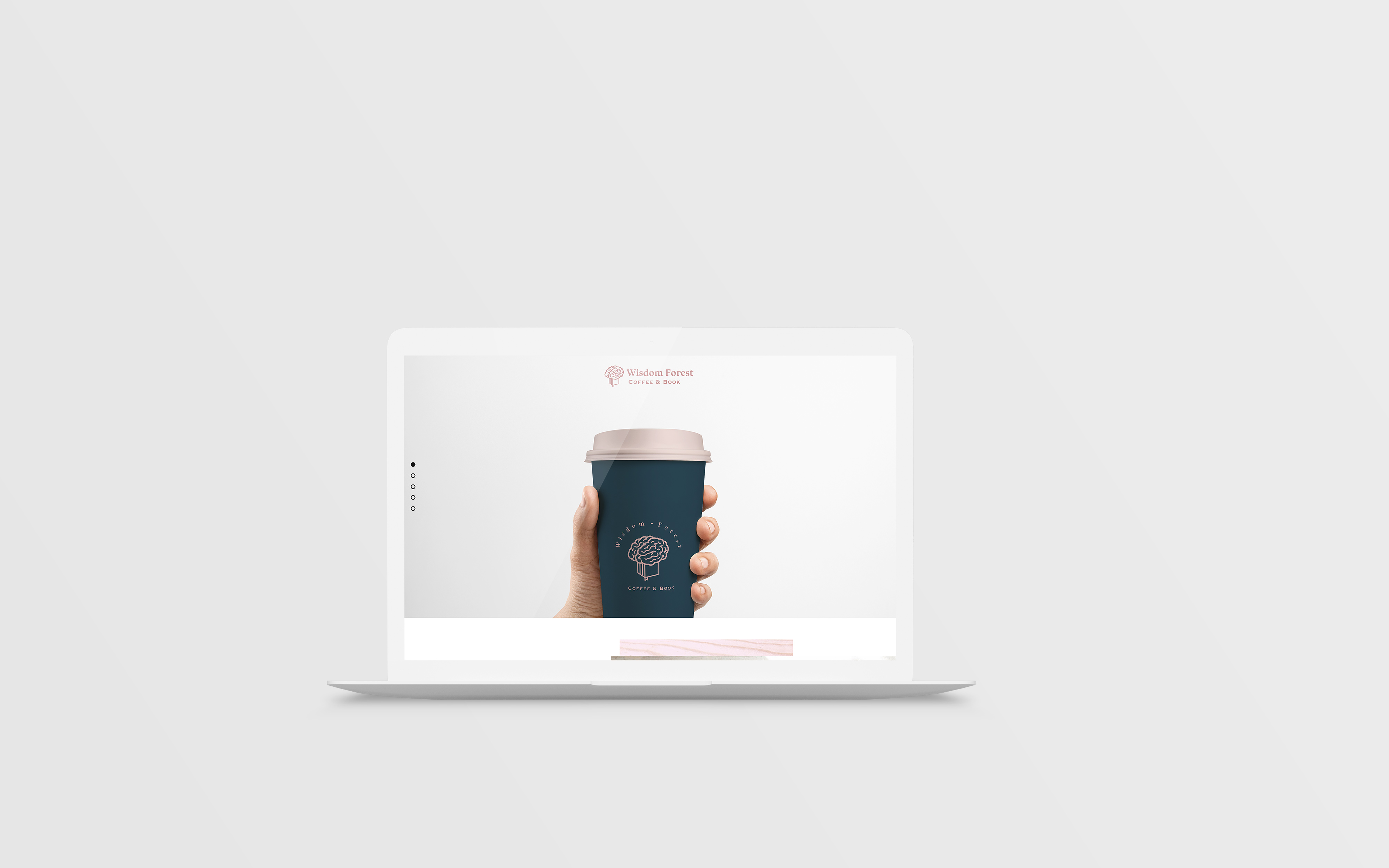
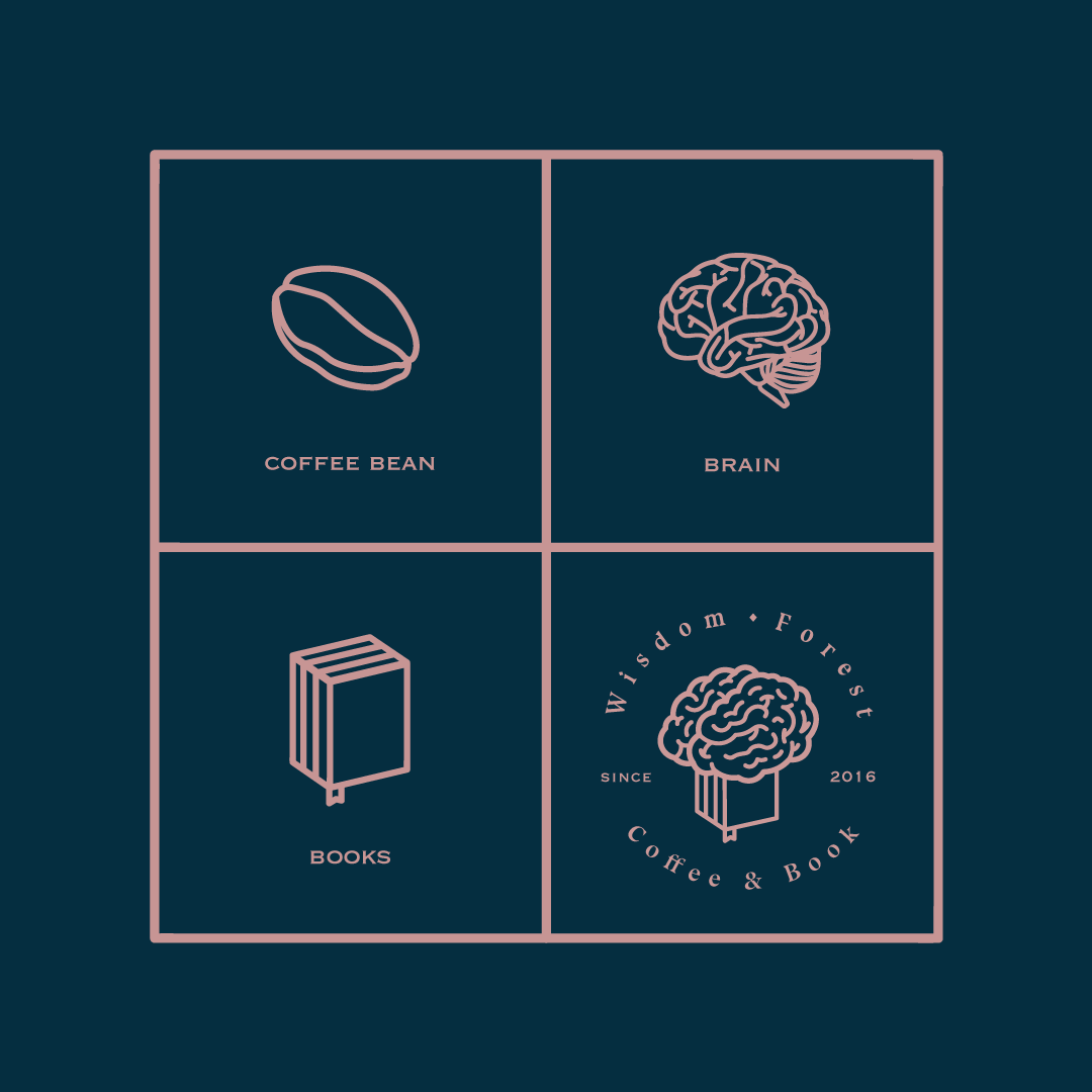
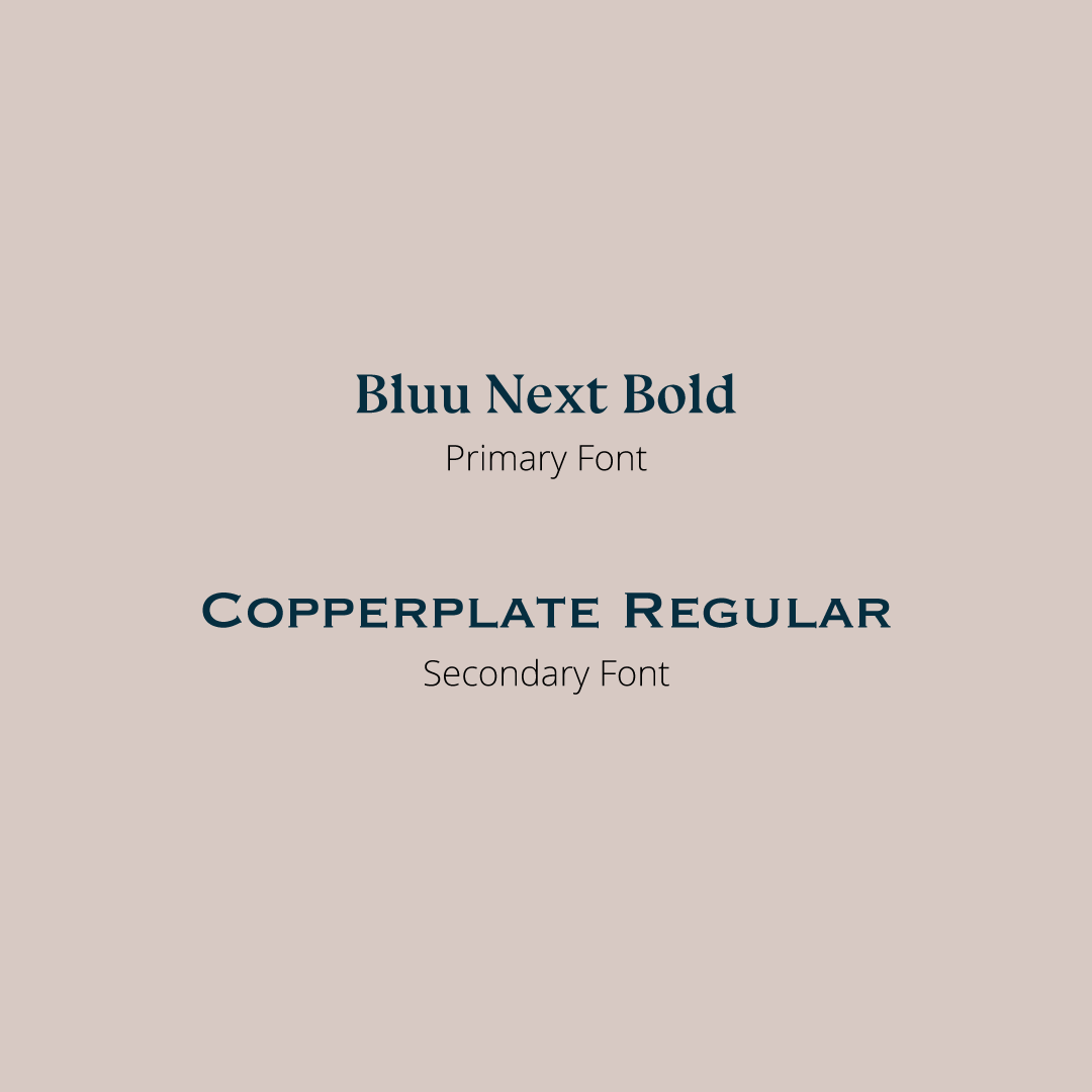
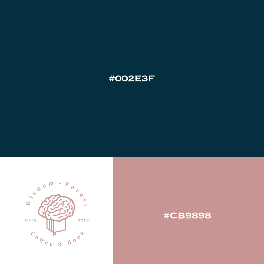
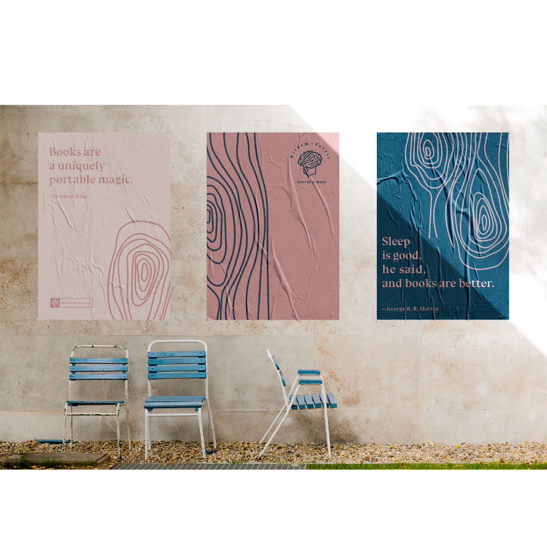
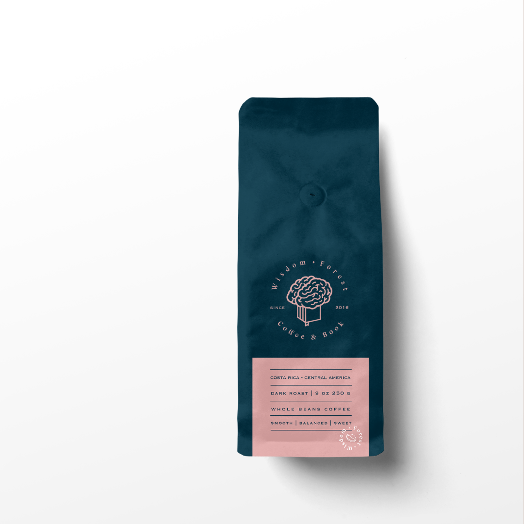
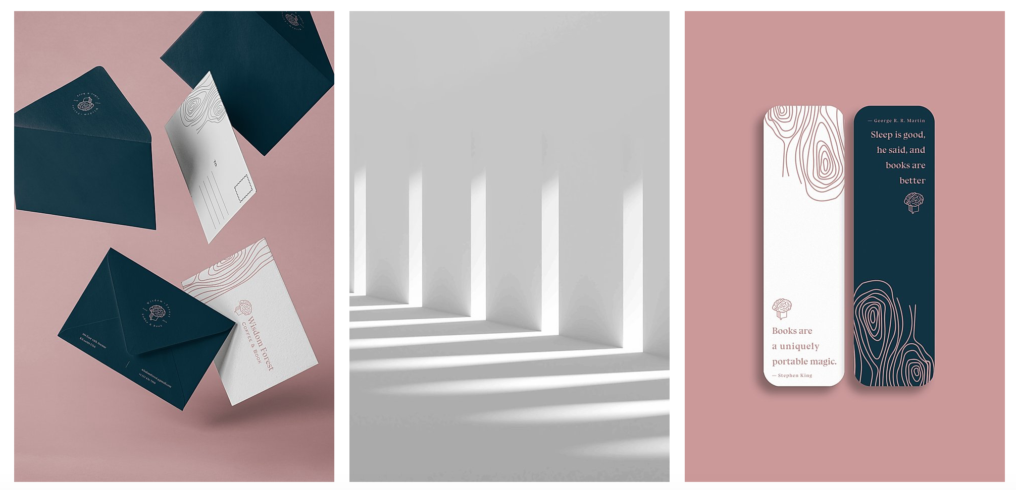
Wisdom Forest
Illustrative brand world for a children's education platform rooted in wonder and curiosity.

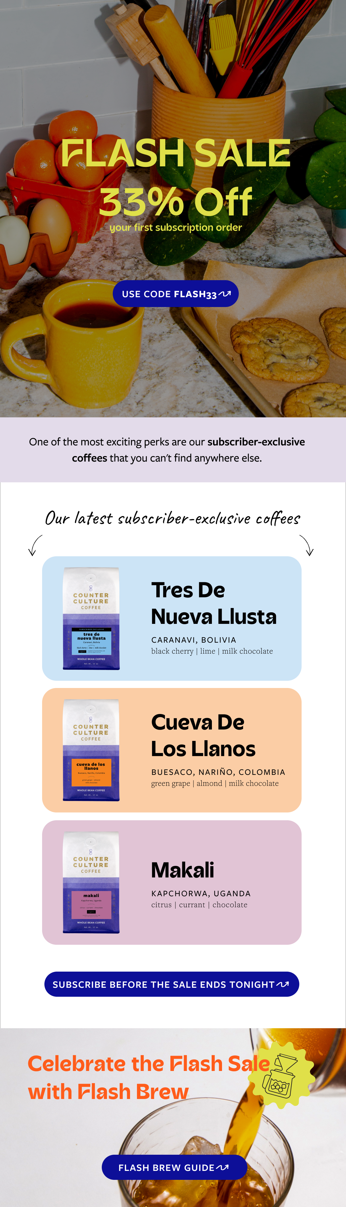
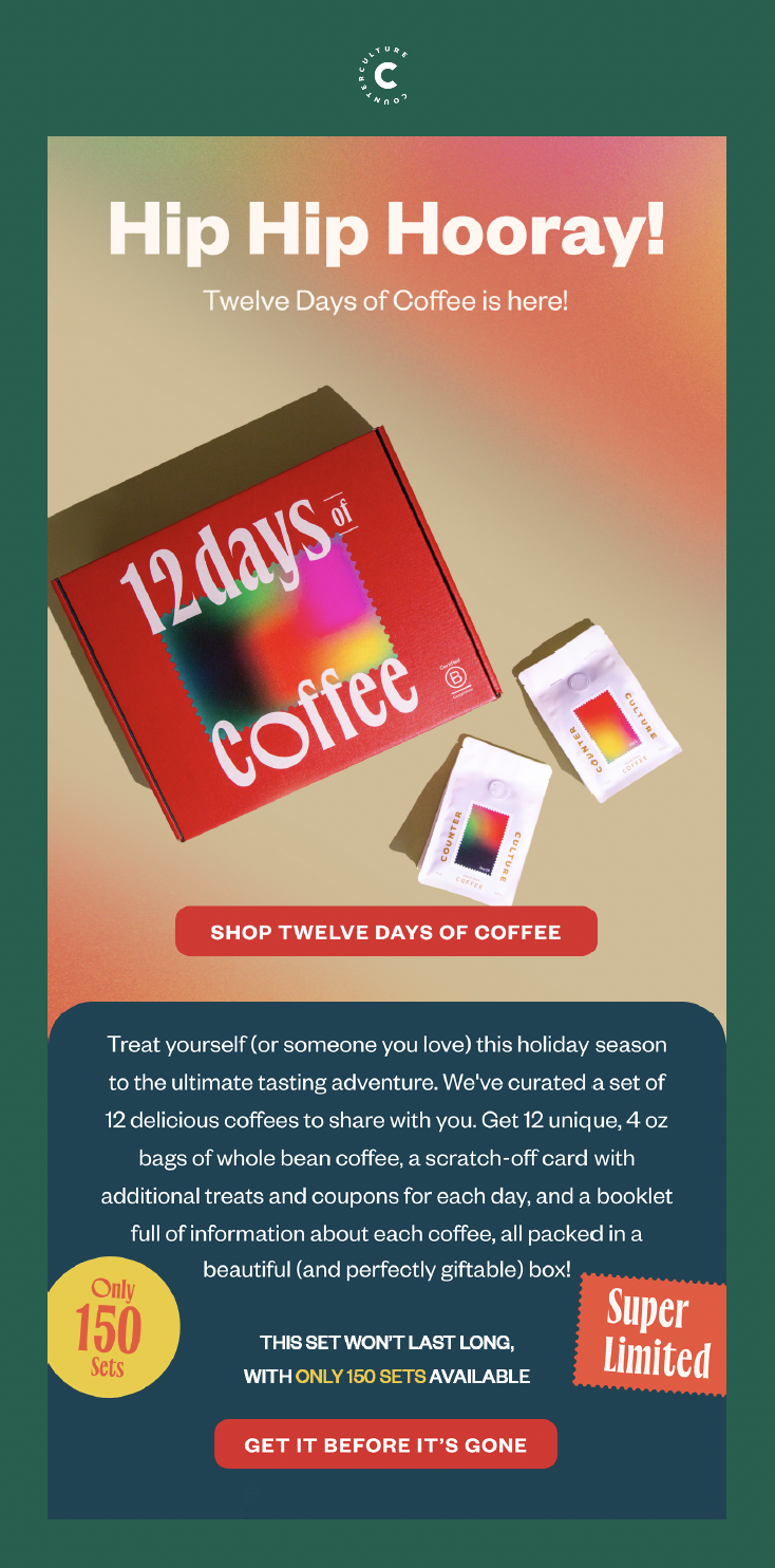
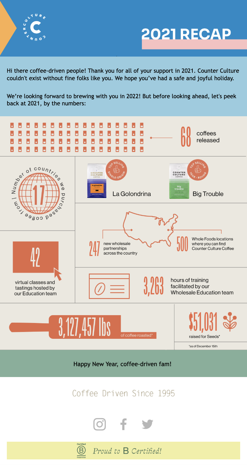
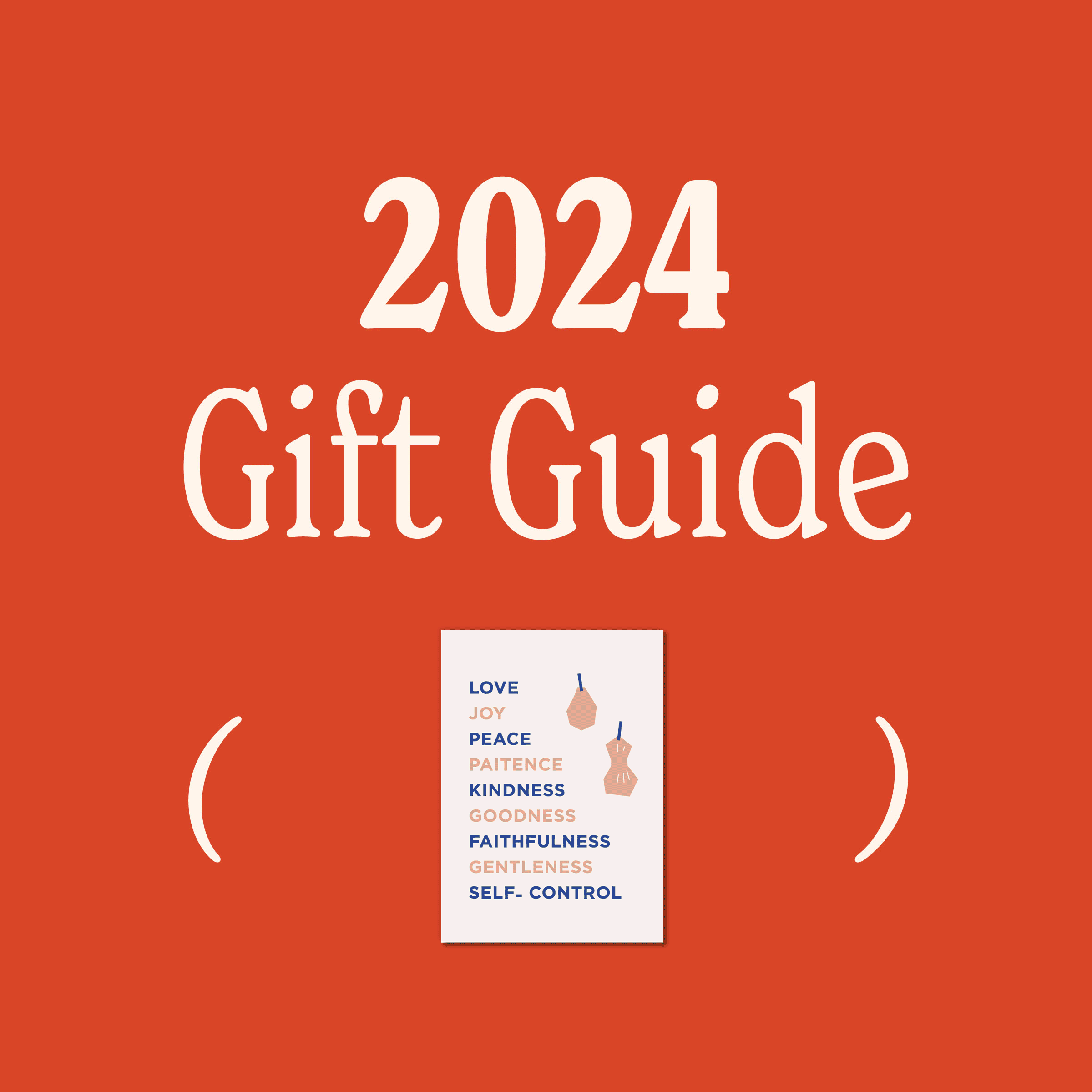
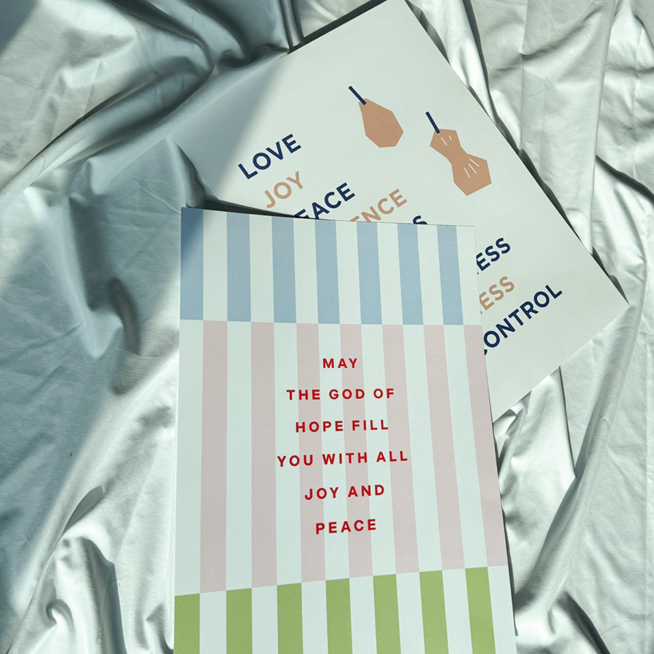
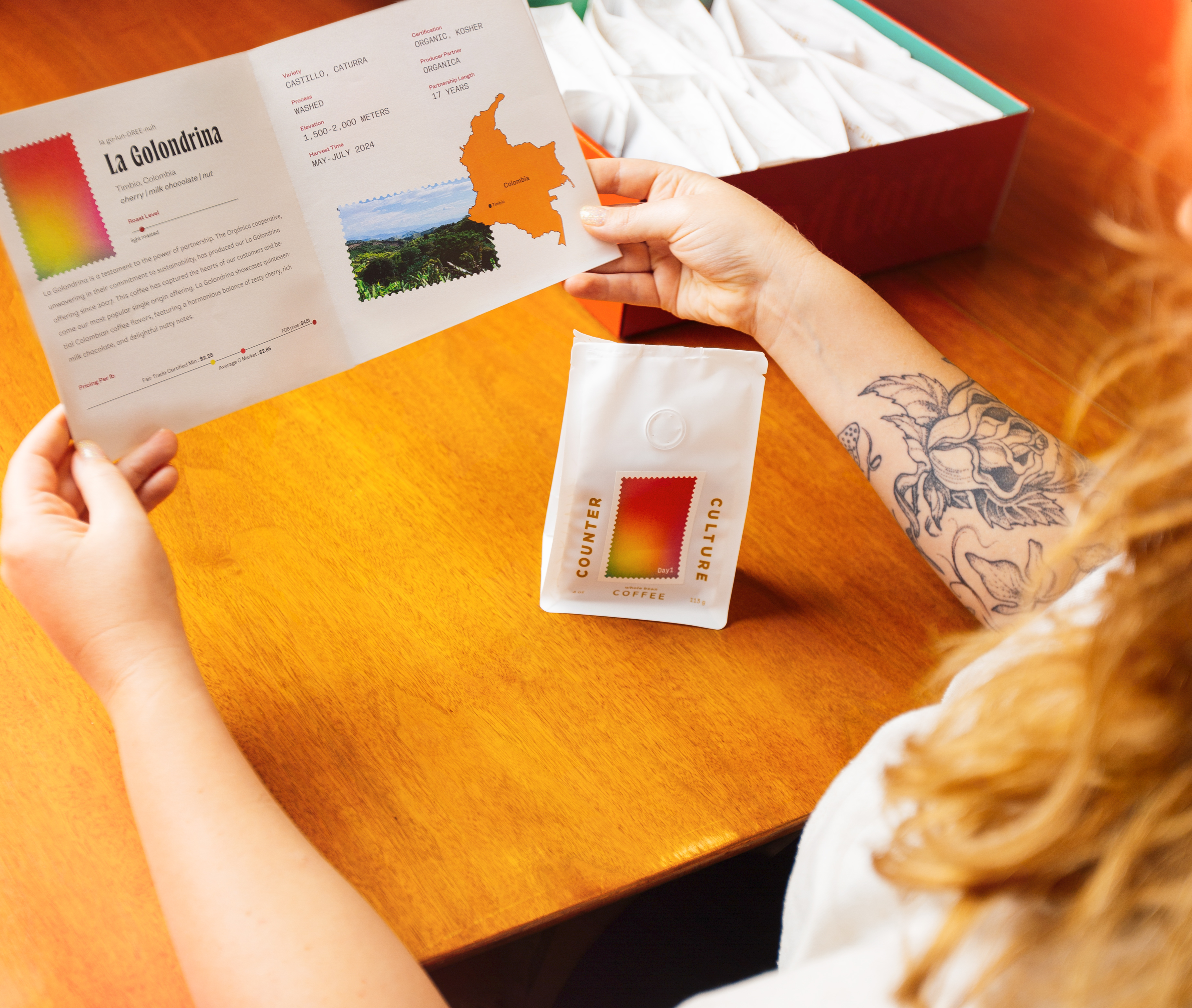
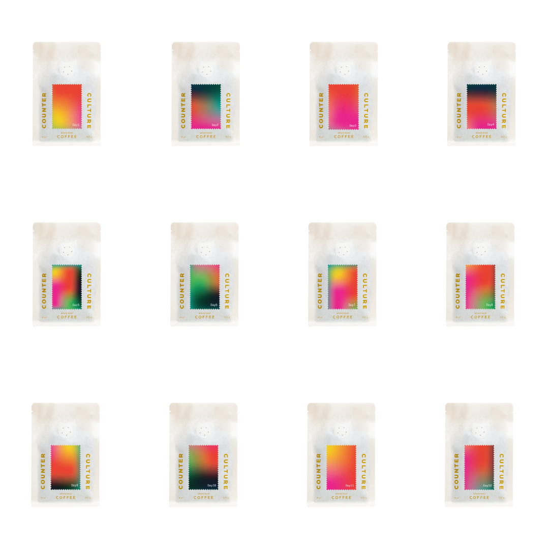
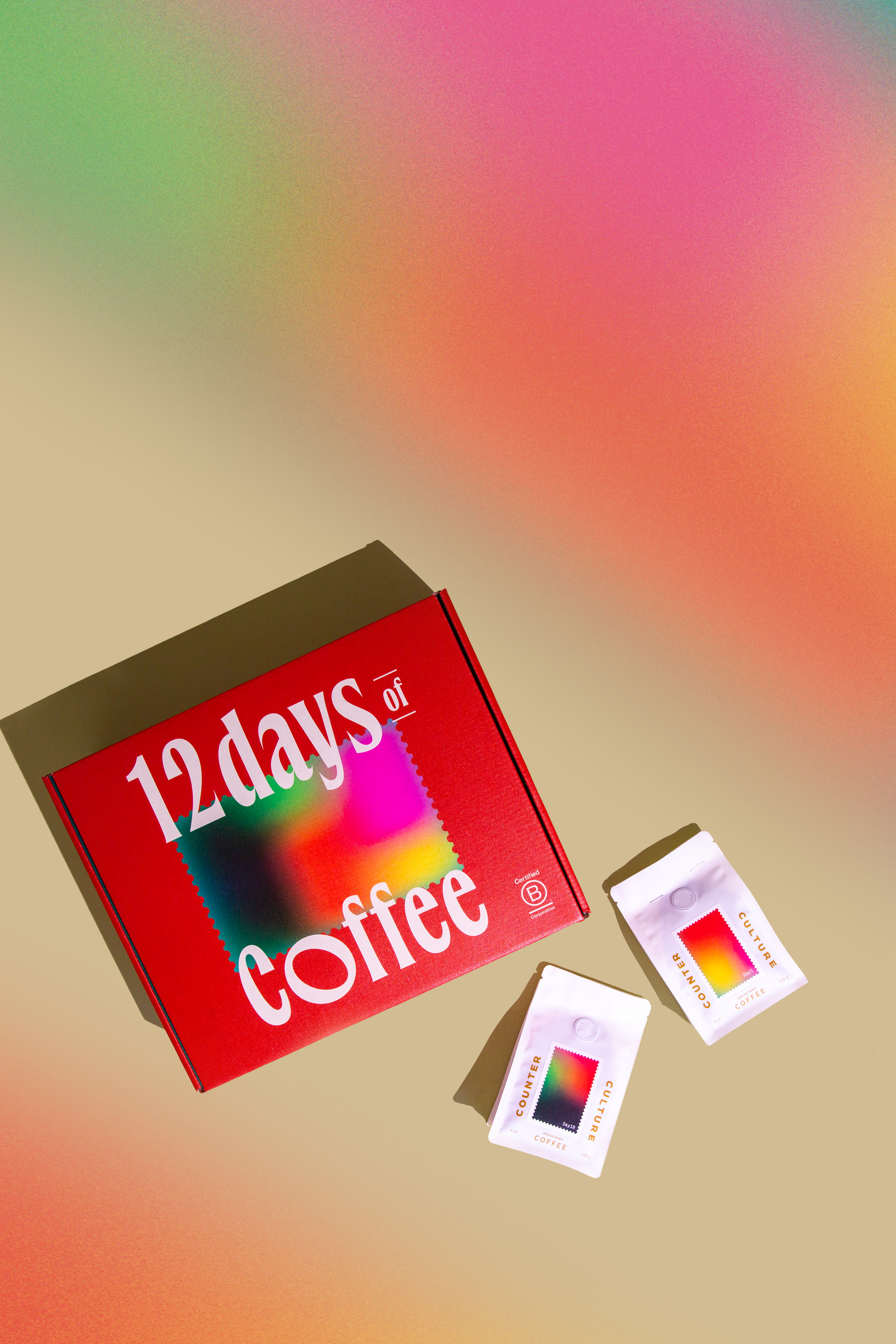
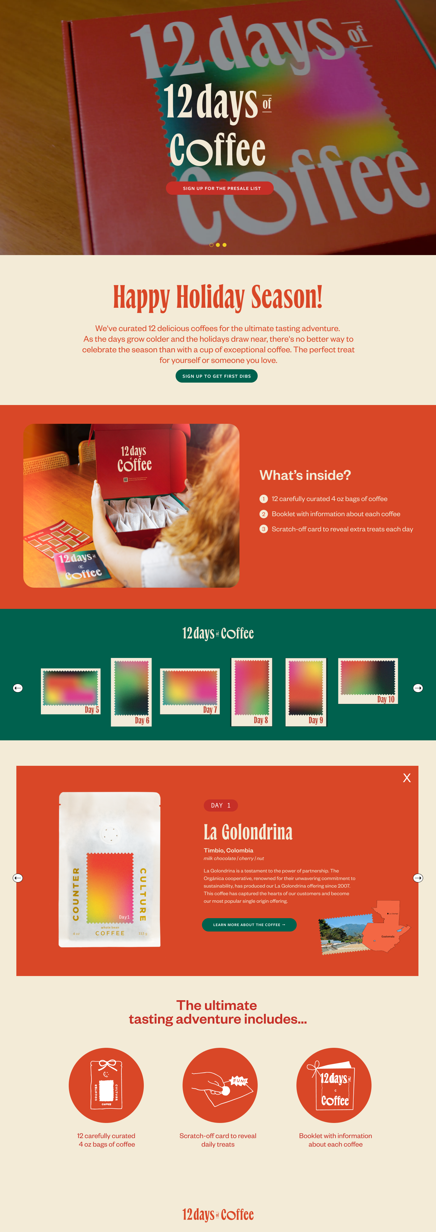
12 Days of Coffee
A holiday campaign blending warmth, ritual, and specialty coffee culture into a gift series.
Other Works
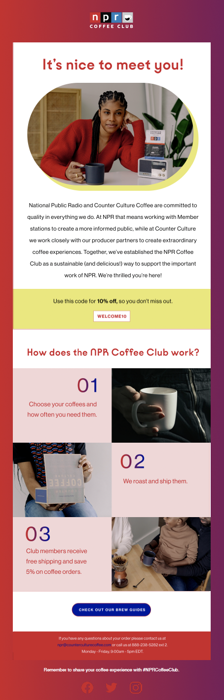
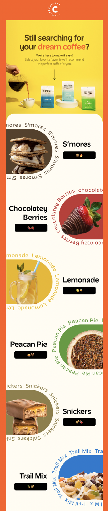
Email & Social
+Motion & Illustration
+Poster & Logo
+